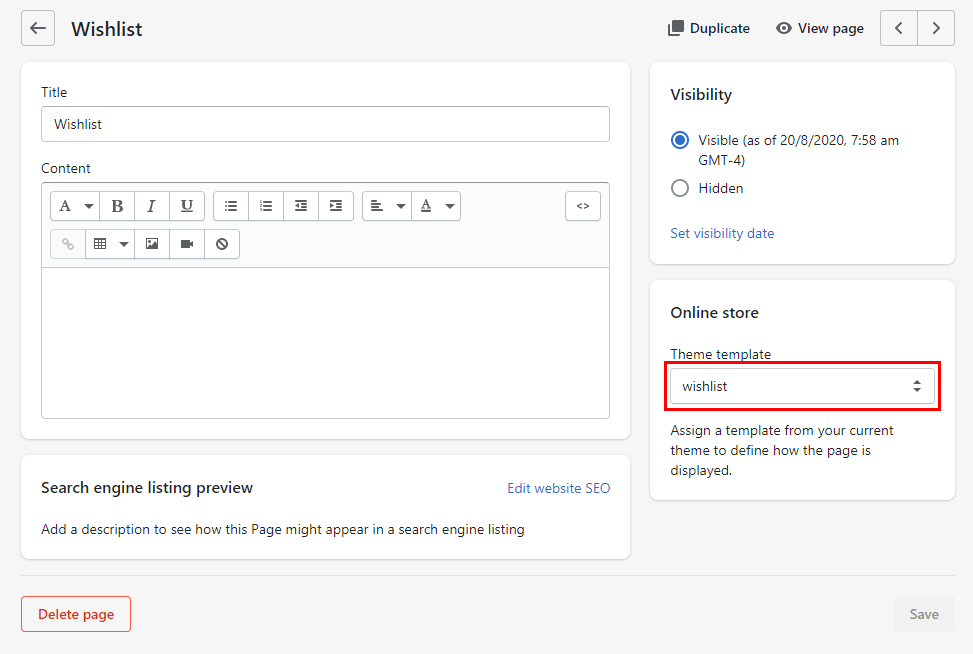
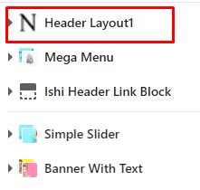
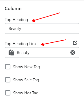
After you add a metafield definition, you add values for your metafield on the corresponding pages in your Shopify admin.
Metafields are displayed in an editable table on your Shopify admin pages. Each metafield displays the name that you selected when you created your metafield definition. You can click in each table row to display the type of metafield and its description, and then enter a value.
Metafield content types and values:
The following table contains basic instructions for adding values to common types of metafields, as well as example use cases for each type
| # |
Content type |
Description |
| 1 |
Color |
Supports RGB values in #RRGGBB format.
|
| 2 |
Date |
Supports date values in ISO 8601 format and time values in UTC time.
|
| 3 |
Dimension |
Supports both whole number and decimal values. The units of measurement can be configured using either the metric or the imperial system.
|
| 4 |
Weight |
Supports both whole number and decimal values. The units of measurement can be configured using either the metric or the imperial system.
|
| 5 |
Volume |
Supports both whole number and decimal values. The units of measurement can be configured using either the metric or the imperial system.
|
| 6 |
Money |
Supports decimal values for price in your store currency, for example, USD.
|
| 7 |
Number |
Supports either integer or decimal values, depending on how you configure your definition.
Integer values can be in the range of -4,611,686,018,427,387,904 to 4,611,686,018,427,387,903.
Decimal values can be in the range of +/-9999999999999.999999999, with up to 13 digits before the decimal and up to 9 digits after.
|
| 8 |
Rating |
Provides a slider for selecting whole numbers within a given range, depending on how you configure your definition.
|
| 9 |
Product reference |
Supports linking to one or more products, depending on how you configure your metafield definition.
|
| 10 |
Product variant reference |
Supports linking to one or more product variants, depending on how you configure your metafield definition.
|
| 11 |
File reference |
Supports uploading a single file in one of the following file types:
images & all file types
Images in JPEG, PNG, and GIF formats are displayed on your online store. All other file types are displayed as available for download.
|
| 12 |
Page reference |
Provides a link to a page in your online store.
|
| 13 |
URL |
Supports HTTP, HTTPS and mailto: URLs. You can limit URLs to specific domains when you create your metafield definition.
|
| 14 |
Text |
Supports plain text in either single-line or multi-line fields. Multi-line fields can include line breaks
|
| 15 |
True or false |
Creates a checkbox for selecting whether a condition is true or false.
|
| 16 |
JSON |
Supports raw JSON data for advanced scenarios when you need a structured data source.
|

.png)
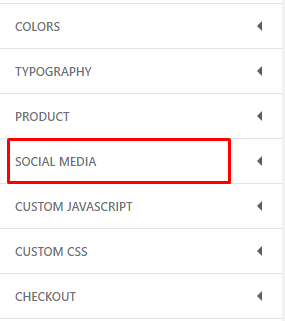
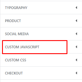


Social Media