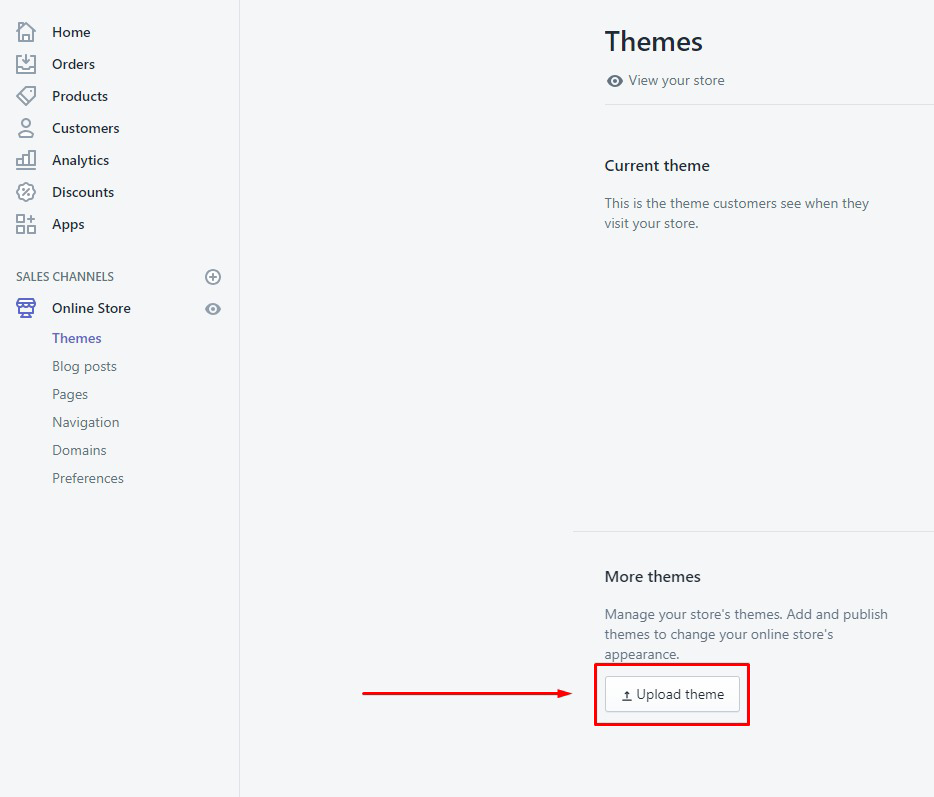
Theme Installation

If you have not purchased the theme yet, you can purchase it from here.
Thank you! We are glad that you have choosen us.
For Queries / Customisation requests, feel free to contact us here.
Organsio is our enhanced and beautifully designed responsive Shopify theme for your online Store. Organsio is rich with powerful userfriendly features that would attract more clients to your online store and boost sales!
Here are some basics on installing, configuring and customizing the theme that will get you started! This document is written very carefully by keeping mind Beginners, advanced users and developers.
If you are new to shopify. Please read SHOPIFY GUIDE first and then get along with the theme document.
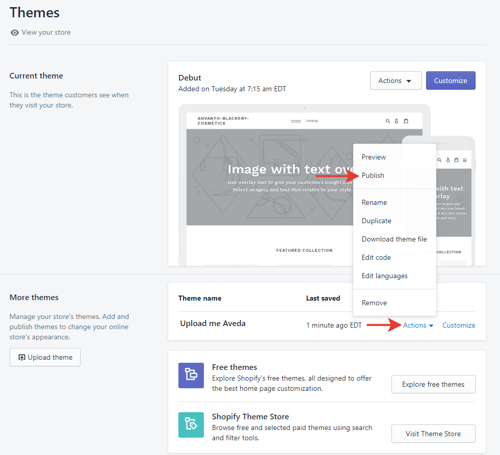
To update the theme without loosing your data please follow these steps :
The theme comes with free apps which can be installed as per your use.
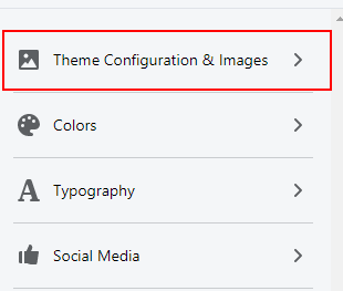
It allows you to configure general theme settings like Header,Footer, Breadcrumb, Colors, Fonts and various other options
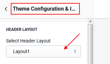
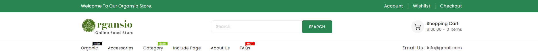
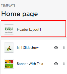
Following are the designs of available headers in the theme :
Layout1
Menu, Header Block,Wishlist,Contact,Checkout, Account,Email Search and Shopping Cart.

Layout2
Menu, Header Block,Wishlist,Contact,Checkout, Account,Email Search and Shopping Cart.

Layout3
Menu, Header Block,Wishlist,Contact,Checkout, Account, Search and Shopping Cart.
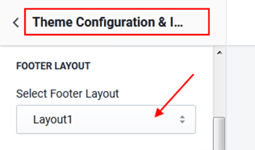
Following are the designs of available footers in the theme :
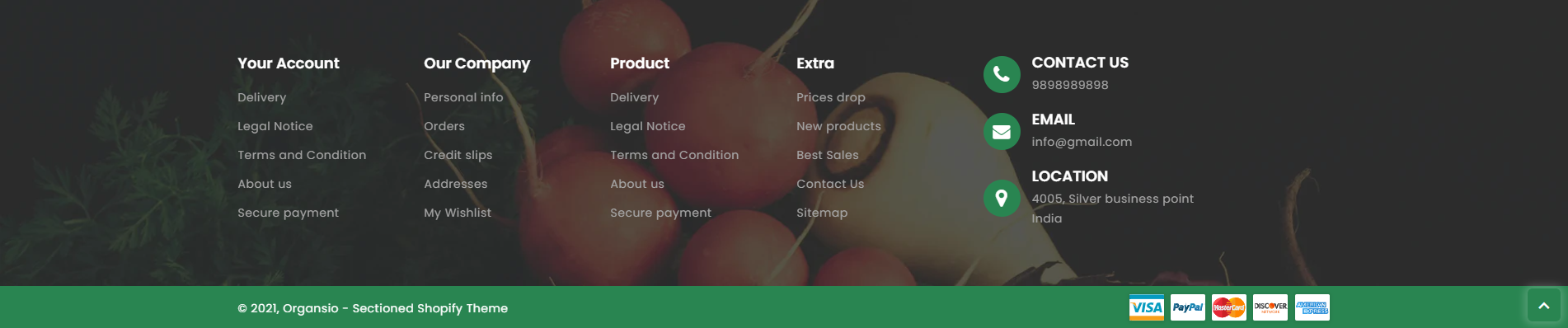
Layout1
Store Info,Store Address,Social Icon, Contact, Email, Footer Links and Payment Icons
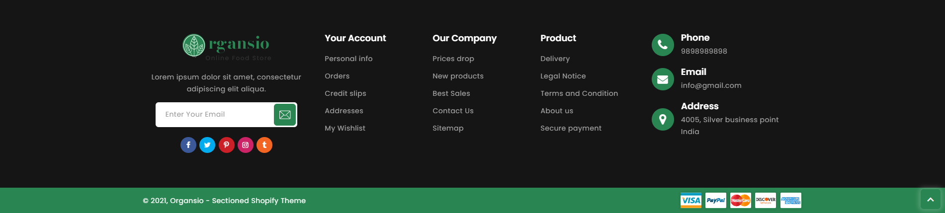
Layout2
Store Address,Social Icon, Contact, Email, Newsletter, Footer Links, Social Links and Payment Icons
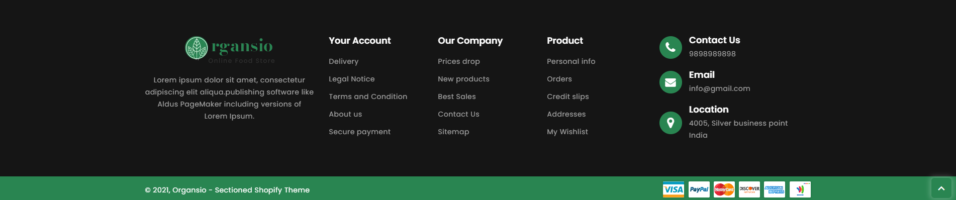
Layout3
Store Info,Store Address,Social Icon, Contact, Email, Footer Links and Payment Icons
| # | Parameter | Value | Description |
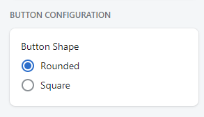
| 1 | Button Shape | Select | Select the Button Shape. The available options are Rounded or Square. |
| # | Parameter | Value | Description |
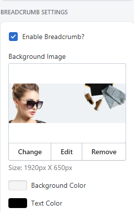
| 1 | Enable Breadcrumb? | True / False | Check if you want to show breadcrumb in your store. |
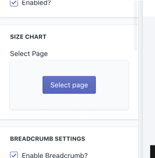
| 2 | Breadcrumb Image | image | Sets a background image for breadcrumb. |
| 3 | Background Color | color | Sets background color for breadcrumb. Works only if image is not configured or image is png. |
| 4 | Text Color | color | Choose a color for the text of the breadcrumb |
| # | Parameter | Value | Description |
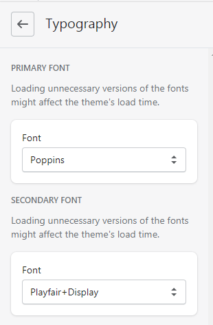
| 1 | Primary Font | Font | Configure the Primary font of the theme. This font is used in most of the parts of the theme. |
| 2 | Secondary Font | Font | Configure the Secondary font of the theme. This font is used in most of the parts of the theme. |

| # | Parameter | Value | Description |
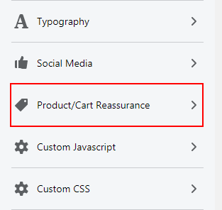
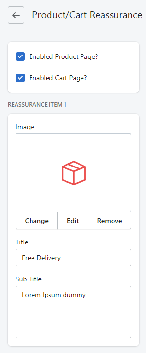
| 1 | Enable Product Page | True / False | Check if you want to enable reassurance in product page. |
| 2 | Enable Cart Page | True / False | Check if you want to enable reassurance in cart page. |
| (Reassurance) | |||
| 3 | Image | Image | Configure the icon for the reassurance. |
| 4 | Title | Text | Configure the title of the reassurance. |
| 5 | Sub Title | Text | Configure the sub title of the reassurance. |
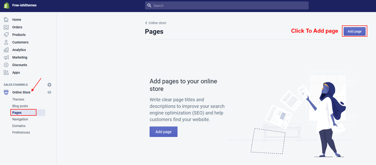
Online Store > Pages click button "Add a page"
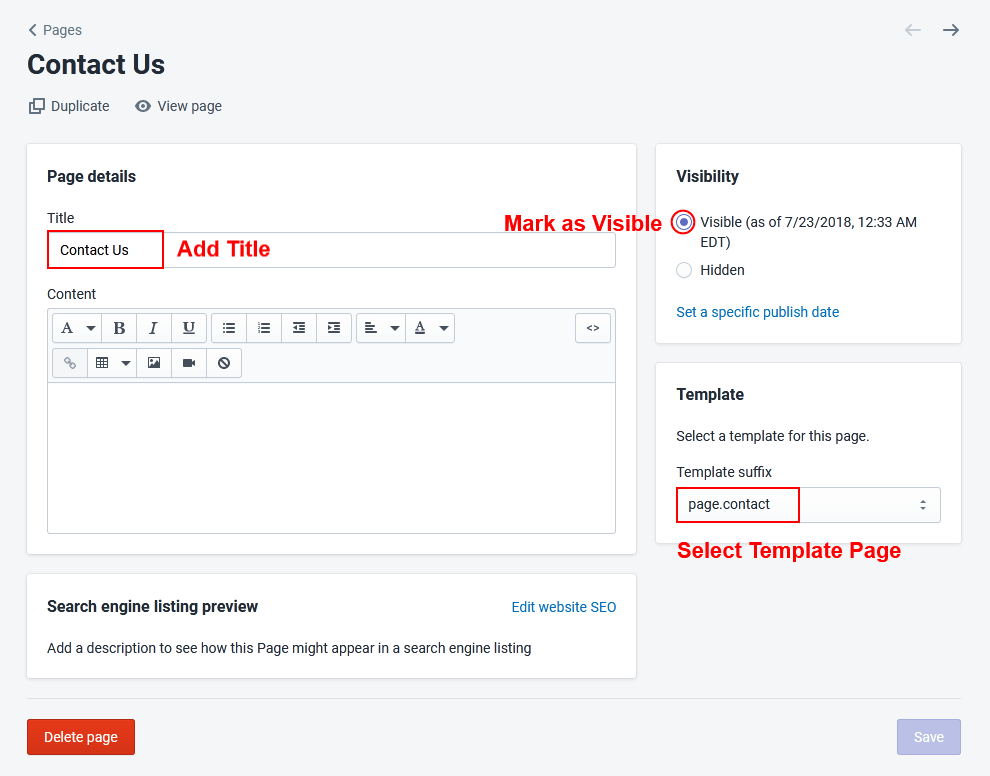
To configure contact us page, navigate to Customizer > Contact Us Page and configure required fields.
| # | Parameter | Value | Description |
| 1 | Show Banner With Address | True / False | Check if you want to show a section banner on the left and address on the right side on the contact page. |
| 2 | Contact Banner | image | Upload the contact page banner image here. |
| 3 | Heading | Text | Configure the title of the address area. |
| 4 | SubHeading | Text | Configure sub title of the address area. |
| 5 | Show Address | True / False | Check if you want to show address on the contact page. |
| 6 | Show Phone Number | True / False | Check if you want to show phone number on the contact page. |
| 7 | Show Email ID | True / False | Check if you want to show email ID on the contact page. |
| 8 | Show Social Follow | True / False | Check if you want to show social follow on the contact page. |
| 9 | Additional Info | Text | Write the additional information description to be displayed with the address of the store. |
| 10 | Google Map | True / False | Check if you want to show embedded google map on the contact page. |
| 11 | Google Map Code | Iframe | Put the iframe code that you can generate from google maps. |
| 12 | Contact Form | True / False | Check if you want to show up contact form on the contact us page. |
| 13 | Title | Text | Configure the title of the contact us form. |
| 14 | Sub Title | Text | Configure the subtitle of the contact us form. |
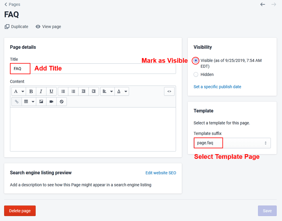
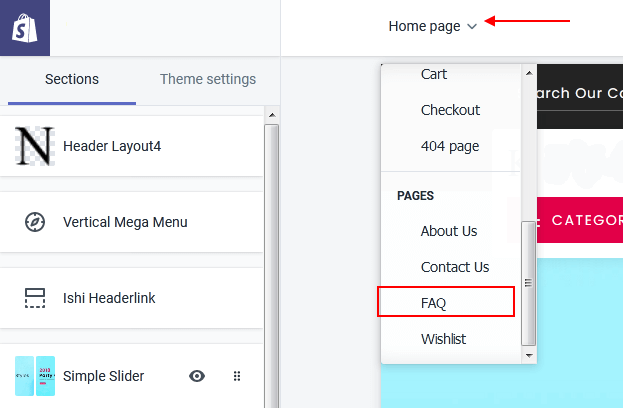
To configure FAQ page, navigate to Customizer > FAQ Page and configure required fields.
| # | Parameter | Value | Description |
| 1 | FAQ Title | Text | Enter the title of the FAQ Section. |
| 2 | FAQ Count | True / False | Check if you want to display serial number on each question. |
| Content (You can add as many FAQs you want.) | |||
| 3 | FAQ Question | Text | Configure the Question for the FAQ. |
| 4 | FAQ Answer | Text | Configure the Answer for the FAQ. |
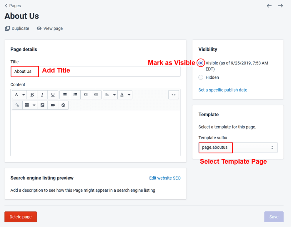
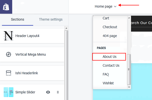
To configure About Us page, navigate to Customizer > About Us Page and configure required fields.
| # | Parameter | Value | Description |
| 1 | Main Title | Text | Configure the title of about us page. |
| 2 | About Banner Block | True / False | Check if you want to show banner with description block on the contact page |
| 3 | About Banner Image | Image | Configure the banner image for the section |
| 4 | Hover | Select | Select a hover for the banner image. |
| 5 | Link | URL | Configure the URL to which customer should be redirected on clicking the banner image. |
| 6 | Heading | Text | Configure the heading of the description. |
| 7 | Decripition | Text | Configure the description. |
| 8 | Button Text | Text | Configure button text. |
| 9 | Link | URL | Configure the URL to which customer should be redirected on clicking the Button. |
| 11 | Service Section Title | Text | Configure the title of the services section. |
| 12 | Service Section Sub Title | Text | Configure sub title of the services section. |
| Content (Services) | |||
| 13 | Service Image | Image | Configure the image of the service. |
| 14 | Service Heading | Text | Configure the heading of the service. |
| 15 | Service Description | Text | Configure the description of the service. |
| 16 | Service Link | URL | Configure the URL to which customer should be redirected on clicking the service. |
Go to Customizer > Sections > Add Section.
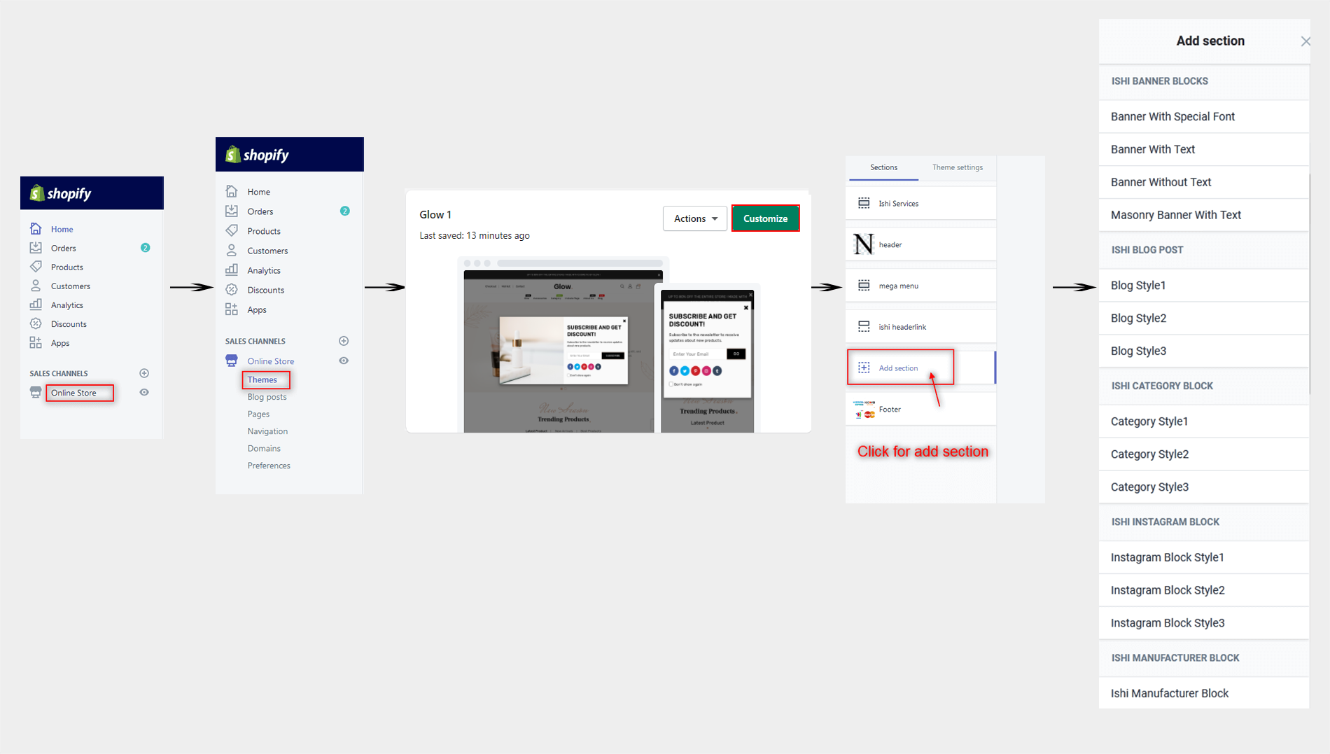
To configure Header, navigate to Customizer > Header and configure required fields.
| # | Parameter | Value | Description |
| 1 | Primary Logo | Image | Configure the logo of the store here. |
| 2 | Secondary Logo | Image | Secondary Logo is visible only on the top of the homepage and nowhere else. |
| 3 | Max Logo Width | Number | Configure the max size of the logo in pixels. |
| Content (Megamenu) | |||
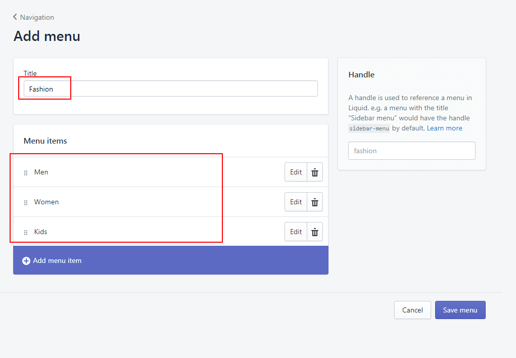
| Steps to configure menu items is shown here | |||
| # | Parameter | Value | Description |
| 1 | Announcement Bar Text | Text | Write your annoucements like sale, introductory offers etc. |
| 2 | Show Checkout | True / False | Check if you want to show Checkout in the header. |
| 3 | Show Wishlist | True / False | Check if you want to show Wishlist in the header. |
| 4 | Desktop Logo Image | Image | Configure the logo of the store here. |
| 5 | Mobile Logo Image | Image | Configure the logo of the store here. |
| 6 | Max Logo Width | Number | Configure the max size of the logo in pixels. |
| 7 | Cart Title | Number | Configure the Cart Title. |
| 8 | Email Title | Number | Configure the Email Title. |
| 9 | Show Email Id | True / False | Check if you want to show email id in the header. |
| # | Parameter | Value | Description |
| 1 | Announcement Bar Text | Text | Write your annoucements like sale, introductory offers etc. |
| 4 | Desktop Logo Image | Image | Configure the logo of the store here. |
| 5 | Mobile Logo Image | Image | Configure the logo of the store here. |
| 6 | Max Logo Width | Number | Configure the max size of the logo in pixels. |
| 2 | Show Checkout | True / False | Check if you want to show Checkout in the header. |
| 3 | Show Wishlist | True / False | Check if you want to show Wishlist in the header. |
| 7 | Cart Title | Number | Configure the Cart Title. |
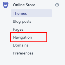
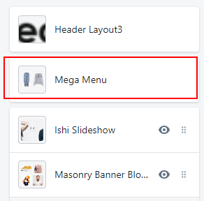
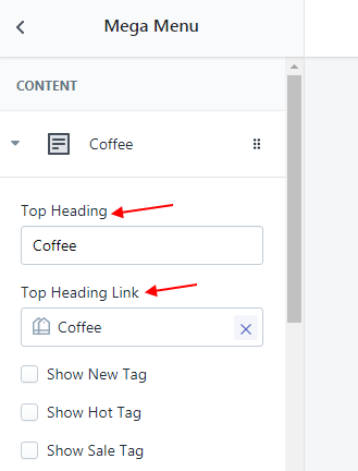
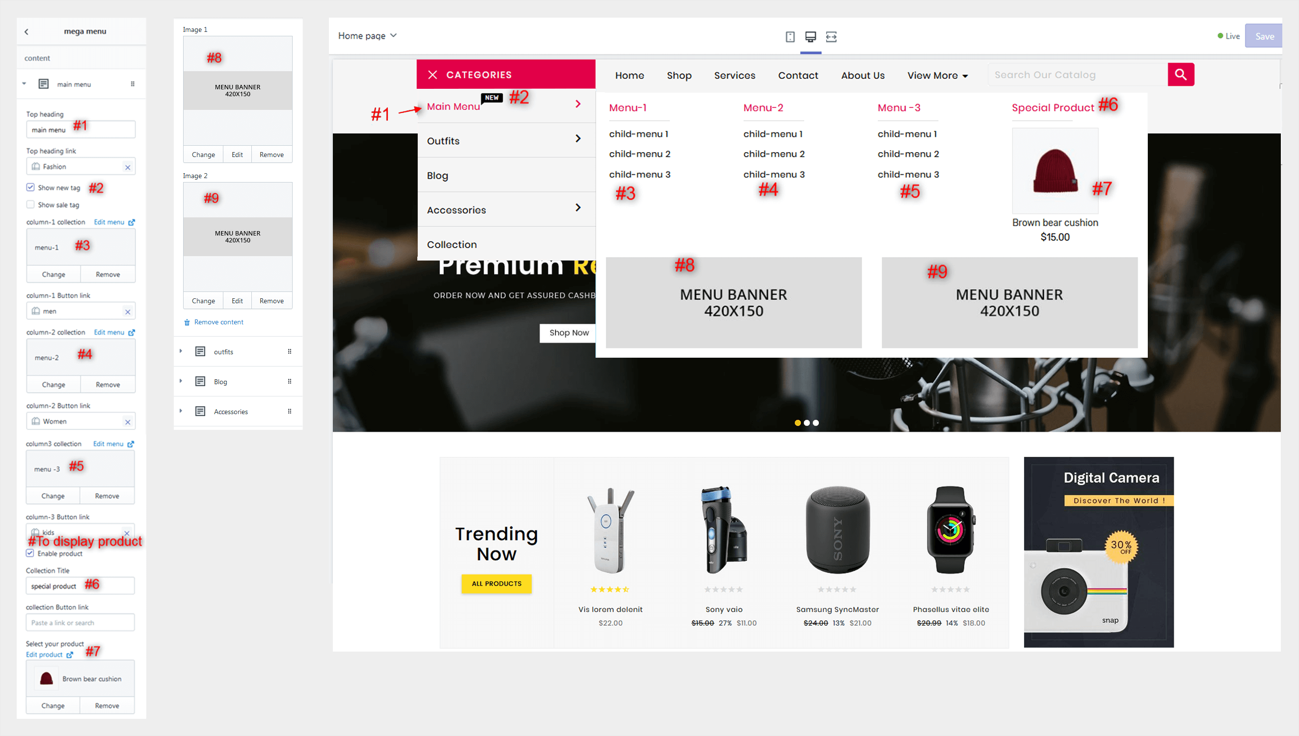
To configure Mega Menu, navigate to Customizer > Mega Menu and configure required fields.
Shows slides of images usually below the header. There are various options available. Each of them are described below.
To configure Simple Slider, navigate to Customizer > Simple Slider and configure required fields.
| # | Parameter | Value | Description |
| 1 | Desktop Bottom Margin | Number | Configure the space between the current section and the following section on desktop version. |
| 2 | Mobile Bottom Margin | Number | Configure the space between the current section and the following section on mobile version. |
| Content (Slider) | |||
| 3 | Image | Image | Configure the image for the slider. |
| 4 | Text Position | Select | Select Text Position. The Design of the section will change based on the chooen style. |
| 5 | Text Alignment | Select | Select Text Alignment. The Design of the section will change based on the chooen style. |
| 6 | Sub Title | Text | Configure the sub title for the slider. |
| 7 | Sub Title Color | Color | Configure the text color of the sub title. |
| 8 | Title | Text | Configure the title for the slider. |
| 9 | Title Color | Color | Configure the text color of the title. |
| 10 | Description | Text | Configure the description for the slider. |
| 11 | Description Color | Color | Configure the text color of the description title. |
| 12 | Button Label | Text | Configure the label of the button. |
| 13 | Link | URL | Configure the URL to which customer should be redirected on clicking the slider. |
Shows Products on the store. Each section offers different layouts and designs.
Displays the product collections in the form of tabs. You can add products into a collection and configure the collection in this section to show up products.
To configure Product Block Style 1, navigate to Customizer > Product Block Style 1 and configure required fields.
| # | Parameter | Value | Description |
| 1 | Main Title | Text | Configure main title of the section. |
| 2 | Total Product From Collection | Number | Configure total number of products that should be fetched from the collection. |
| 3 | Max Products Columns For Mobile View | Number | Configure maximum number of columns for mobile view. |
| 4 | Max Products Columns For Small Tablet View | Number | Configure number of columns for tablet view. |
| 5 | Max Products Columns For Tablet View | Number | Configure number of columns for tablet view. |
| 6 | Max Products Columns For Laptop View | Number | Configure number of columns for laptop view. |
| 7 | Max Products Columns For Desktop View | Number | Configure number of columns for Desktop view. |
| 8 | Max Products Rows | Select | Configure number of rows to be shown. |
| 9 | Desktop Bottom Margin | Number | Configure the space between the current section and the following section on desktop version. |
| 10 | Mobile Bottom Margin | Number | Configure the space between the current section and the following section on mobile version. |
| Content (Product Block) | |||
| 11 | Product Tab Title | Text | Configure the tab title of the block |
| 12 | Collection | Select | Configure the collection to be shown. |
| 13 | Show View All Button | True / False | Check if you want to show view all button which redirects user to collection page on click. |
Shows up products from a collection that is configured in the section settings. In this section product images are on the left and product information is on the rightside.
To configure Product Block Style 2, navigate to Customizer > Product Block Style 2 and configure required fields.
| # | Parameter | Value | Description |
| 1 | Main Title | Text | Configure main title of the section. |
| 2 | tab Layout | Select | Select tab layout of the section. |
| 3 | Total Product From Collection | Number | Configure total number of products that should be fetched from the collection. |
| 4 | Desktop Bottom Margin | Number | Configure the space between the current section and the following section on desktop version. |
| 5 | Mobile Bottom Margin | Number | Configure the space between the current section and the following section on mobile version. |
| Content (Product Block) | |||
| 6 | Icon Image | Image | Configure the image for the section. |
| 7 | Product Tab Title | Text | Configure the tab title of the block. |
| 8 | Collection | Select | Configure the collection of products to be shown. |
| 9 | Show View All Button | True / False | Check if you want to show view all button which redirects user to collection page on click. |
Shows up products from a collection that is configured in the section settings. In this section product images are on the left and product information is on the rightside.
To configure Product Block Style 3, navigate to Customizer > Product Block Style 3 and configure required fields.
| # | Parameter | Value | Description |
| 1 | Background Color | Color | Configure the text background color of the section. |
| 2 | Main Title | Text | Configure main title of the section. |
| 3 | Total Product From Collection | Number | Configure total number of products that should be fetched from the collection. |
| 4 | Max Products Rows | Select | Configure number of rows to be shown. |
| 5 | Desktop Bottom Margin | Number | Configure the space between the current section and the following section on desktop version. |
| 6 | Mobile Bottom Margin | Number | Configure the space between the current section and the following section on mobile version. |
| Content (Product Block) | |||
| 7 | Collection | Select | Configure the collection of products to be shown. |
| 8 | Show View All Button | True / False | Check if you want to show view all button which redirects user to collection page on click. |
Shows banners on the store. You can add banners with text, without text etc. The banners usually shows deals, new launches and other attractive offers of the store. Each available option are explained below.
This section allows you to add text on the banners using options provided in the section.
To configure Banner With Text, navigate to Customizer > Banner With Text and configure required fields.
| # | Parameter | Value | Description |
| 1 | Layout | Select | Select layout. The available options are Box or Full. |
| 2 | Number Of Columns | Select | Enter number of columns for the banners |
| 3 | Banner Left & Right Internal Spacing/Padding | Number | Configure internal spacing between each banner in pixels. |
| 4 | Desktop Bottom Margin | Number | Configure the space between the current section and the following section on desktop version. |
| 5 | Mobile Bottom Margin | Number | Configure the space between the current section and the following section on mobile version. |
| Content (Banner With Text) | |||
| 6 | Text Position | Select | Select Text Position. The Design of the section will change based on the chooen style. |
| 7 | Text Alignment | Select | Select Text Alignment. The Design of the section will change based on the chooen style. |
| 8 | Banner Image | Image | Configure the image of the banner. |
| 9 | Sub Title | Text | Configure sub title of the banner. |
| 10 | Sub Title Color | Color | Configure sub title color of the banner. |
| 11 | Title | Text | Configure sub title of the banner. |
| 12 | Title Color | Color | Configure title color of the banner. |
| 13 | Button Label | Text | Configure the label of the button |
| 14 | Button Link | URL | Configure the URL to which customer should be redirected on clicking the button. |
Displays images with titles as a slider or grid that lists out added categories on the store. You can add as many images you want.
Displays categories with images and titles in a simple form.
To configure Category Block, navigate to Customizer > Category Block and configure required fields.
| # | Parameter | Value | Description |
| 1 | background Image | Image | Configure the background image of the section. |
| 2 | Background color | Color | Configure the background color of the section. It is visible only if background image is not configured. |
| 3 | Internal Box Space/Padding | Number | Configure box space padding of the section. |
| 4 | Main Title | Text | Configure the main title of the section. |
| 5 | Desktop Bottom Margin | Number | Configure the space between the current section and the following section on Desktop version. |
| 6 | Mobile Bottom Margin | Number | Configure the space between the current section and the following section on Mobile version. |
| Content (Category) | |||
| 7 | Category Image | Image | Configure the image for the category. |
| 8 | Title | URL | Configure the title for the category. |
| 9 | Link | URL | Configure the URL to which customer should be redirected on clicking the category. |
Displays Little Description about Store.
To configure Ishi Story Block, navigate to Customizer > Ishi Story Block and configure required fields.
| # | Parameter | Value | Description |
| 1 | Image-1 | Banner | Configure the banner of the story block. |
| 2 | Image-2 | Banner | Configure the banner of the story block. |
| 3 | Sub Title | Text | Configure sub title of the section. |
| 4 | Main Title | Text | Configure main title of the section. |
| 5 | Description 1 | Text | Configure description1 of the section. |
| 6 | Video Title | Text | Configure video title of the section. |
| 7 | Video URL | Video | Configure video URL of the story block. |
| 8 | Description 2 | Text | Configure description2 of the section. |
| 9 | Button Label | Text | Configure the label of the button. |
| 10 | Button Link | URL | Configure the URL to which customer should be redirected on clicking the button. |
| 11 | Desktop Bottom Margin | Number | Configure the space between the current section and the following section on Desktop version. |
| 12 | Mobile Bottom Margin | Number | Configure the space between the current section and the following section on Mobile version. |
Shows up a fixed image in the background with a parallax effect. You can add custom texts using the section settings. You can also add a countdown timer to showup upcomming products, deals and events on the store.
Displays an image in background with a parallax effect and informatory texts above the image.
To configure Parallax Block Style, navigate to Customizer > Parallax Block Style and configure required fields.
| # | Parameter | Value | Description |
| 1 | background Image | Image | Configure the background image of the section. |
| 2 | Background color | Color | Configure the background color of the section. It is visible only if background image is not configured. |
| 3 | Background Attachment Fixed ? | True/false | Check if you want to keep the background sticky on scroll. |
| 4 | Parallax Top & Bottom Internal Padding | Number | Configure top and bottom internal padding of the section. |
| 5 | Text Position | Select | Configure the text position. Available options aer Left, Right and Center. |
| 6 | Text Alignment | Select | Configure the text alignment. Available options aer Left, Right and Center. |
| 7 | Background Color | Color | Configure the background color of the text. |
| 8 | Background Opacity | Opacity | Configure the opacity color of the background. |
| 9 | Text Color1 | Color | Configure the primart text color of the parallax section. |
| 10 | Text Color2 | Color | Configure the secondary text color of the parallax section. |
| 11 | Countdown Background Color | Color | Configure the background color of the countdown. |
| 12 | Countdown Text Color | Color | Configure the text color of the countdown. |
| 13 | Countdown Background Hover Color | Color | Configure the background hover color of the countdown. |
| 14 | Countdown Text Hover Color | Color | Configure the text hover color of the countdown. |
| 15 | Parallax Offer Title | Text | Configure offer title of parallax block. |
| 16 | Parallax Title | Text | Configure main title of parallax block. |
| 17 | Parallax Sub Title | Text | Configure the sub title of the parallax block. |
| 18 | Start Date | Text | Configure the starting date of the parallax timer in the YYY-MM-DD format. |
| 19 | End Date | Text | Configure the ending date of the parallax timer in the YYY-MM-DD format. |
| 20 | Button Label | Text | Configure the label of the button |
| 21 | Button Link | URL | Configure the URL to which customer should be redirected on clicking the button. |
| 22 | Desktop Bottom Margin | Number | Configure the space between the current section and the following section on desktop version. |
| 23 | Mobile Bottom Margin | Number | Configure the space between the current section and the following section on mobile version. |
To configure Ishi Manufacturer Block, navigate to Customizer > Ishi Manufacturer Block and configure required fields.
| # | Parameter | Value | Description |
| 1 | Desktop Bottom Margin | Number | Configure the space between the current section and the following section on desktop version. |
| 2 | Mobile Bottom Margin | Number | Configure the space between the current section and the following section on Mobile version. |
| Content (Manufacturer Logo) | |||
| 3 | Brand Logo Image | Image | Configure the image of the Manufacturerr Logo. |
| 4 | Link | URL | Configure the URL to which customer should be redirected on clicking the Manufacturerr Logo. |
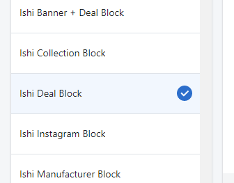
Shows deals on the store. You can add deals on productsand configure start and end date for each of products and showup timer on each product. Each available options are explained below.
To configure Ishi Deal Block, navigate to Customizer > Ishi Deal Block and configure required fields.
| # | Parameter | Value | Description |
| 1 | Main Title | text | Configure the main title of the section. |
| 2 | Length of Characters for Short Product Description. | number | Configure the length of characters for product description. |
| 3 | Desktop Bottom Margin | Number | Configure the space between the current section and the following section on desktop version. |
| 4 | Mobile Bottom Margin | Number | Configure the space between the current section and the following section on mobile version. |
| Content (Product) | |||
| 5 | Select Your Product | Select | Select the product that you want to show up in the deals |
| 6 | Start Date | Text | Configure the starting date of the deal in the YYYY-MM-DD format. |
| 7 | End Date | Text | Configure the ending date of the deal in the YYYY-MM-DD format. |
Shows Products on the store. Each section offers different layouts and designs.
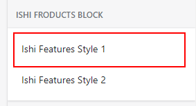
This block displays features offered by the products in your store. You can display icons, title and description. The configuration of section are explained below.
To configure Ishi Features Block, navigate to Customizer > Ishi Features Block and configure required fields.
| # | Parameter | Value | Description |
| 1 | Background Image | Image | Configure the background image of the section. |
| 2 | Background Color | Color | Configure the background color of the section. It is visible only if background image is not configured. |
| 3 | Text Color1 | Color | Configure the primart text color of the section. |
| 4 | Text Color2 | Color | Configure the secondary text color of the section. |
| 5 | Internal Top & Bottom Space Padding | Number | Configure top and bottom internal padding of the section. |
| 6 | Main Title | Text | Configure the main title of the section. |
| 7 | Banner Image | Image | Configure the image for the section. |
| 8 | Desktop Bottom Margin | Number | Configure the space between the current section and the following section on Desktop version. |
| 9 | Mobile Bottom Margin | Number | Configure the space between the current section and the following section on Mobile version. |
| Content (Features) | |||
| 10 | Image | Image | Configure the icon of the features. |
| 11 | Title | Text | Configure the title of features. |
| 12 | Sub Title | Text | Configure the subtitle of features. |
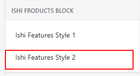
This block displays features offered by the products in your store. You can display icons, title and description. The configuration of section are explained below.
To configure Ishi Features Block, navigate to Customizer > Ishi Features Block and configure required fields.
| # | Parameter | Value | Description |
| 1 | Background Image | Image | Configure the background image of the section. |
| 2 | Background Color | Color | Configure the background color of the section. It is visible only if background image is not configured. |
| 3 | Text Color1 | Color | Configure the primart text color of the section. |
| 4 | Text Color2 | Color | Configure the secondary text color of the section. |
| 5 | Internal Top & Bottom Space Padding | Number | Configure top and bottom internal padding of the section. |
| 6 | Main Title | Text | Configure the main title of the section. |
| 7 | Banner Text | Color | Configure the Banner text of the section. |
| 8 | Button Label | Text | Configure the label of the button. |
| 9 | Link | URL | Configure the URL to which customer should be redirected on clicking the slider. |
| 10 | Banner Image | Image | Configure the image for the section. |
| 11 | Image | Image | Configure the icon of the features. |
| 12 | Title | Text | Configure the title of features. |
| 13 | Sub Title | Text | Configure the subtitle of features. |
| 14 | Desktop Bottom Margin | Number | Configure the space between the current section and the following section on Desktop version. |
| 15 | Mobile Bottom Margin | Number | Configure the space between the current section and the following section on Mobile version. |
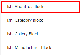
This block displays information regarding the store and offered products. You can display images and texts. The configuration of section are explained below.
To configure Ishi Aboutus Block, navigate to Customizer > Ishi Aboutus Block and configure required fields.
| # | Parameter | Value | Description |
| 1 | Background Image | Image | Configure the background image of the section. |
| 2 | Background Color | Color | Configure the background color of the section. It is visible only if background image is not configured. |
| 3 | Text Color1 | Color | Configure the primart text color of the section. |
| 4 | Internal Box Padding | Number | Configure box padding of the section. |
| 5 | Image | Image | Configure the image for the aboutus block. |
| 6 | Show About Us Banner | True / False | Check if you want to show about us banner. |
| 7 | Sub Title | Text | Configure the sub title of the aboutus block. |
| 8 | Main Title | Text | Configure the main title of the aboutus block. |
| 9 | Description 1 | Text | Configure the description for the aboutus block. |
| 10 | Image | Image | Configure the icon of the features. |
| 11 | Title | Text | Configure the title of features. |
| 12 | Link | URL | Configure the URL to which customer should be redirected on clicking the button. |
| 13 | Button Label | URL | Configure the label of the button. |
| 14 | Button Link | URL | Configure the URL to which customer should be redirected on clicking the button. |
| 15 | Desktop Bottom Margin | Number | Configure the space between the current section and the following section on Desktop version. |
| 16 | Mobile Bottom Margin | Number | Configure the space between the current section and the following section on Mobile version. |
Displays a few blogs on the home page of your store.
To configure Blog, navigate to Customizer > Blog and configure required fields.
| # | Parameter | Value | Description |
| 1 | Main Title | Text | Configure the main title of the BLOG section. |
| 2 | Blog | blogs | Select the blogs that you would like to display on the homepage. |
| 3 | Post | Number | Configure the number of posts that you would like to show. |
| 4 | Show Author | True / False | Check if you want to show up the author name on the blog. |
| 5 | Show Date | True / False | Check if you want to show crated date of the blog. |
| 6 | Show Comment | True / False | Check if you want to show number of conmments on the blog. |
| 7 | Show View All Button | True / False | Check if you want to show view all button on the blog. |
| 8 | Desktop Bottom Margin | Number | Configure the space between the current section and the following section on Desktop version. |
| 9 | Mobile Bottom Margin | Number | Configure the space between the current section and the following section on Mobile version. |
To configure Gallery Block, navigate to Customizer > Gallery Block and configure required fields.
| # | Parameter | Value | Description |
| 1 | Main Title | Text | Configure the main title of the BLOG section. |
| 2 | Desktop Bottom Margin | Number | Configure the space between the current section and the following section on Desktop version. |
| 3 | Mobile Bottom Margin | Number | Configure the space between the current section and the following section on Mobile version. |
| Content (Gallery) | |||
| 4 | Image | Image | Configure the img for the section. |
| 5 | Link | URL | Configure the URL to which customer should be redirected on clicking the section. |
Shows Products on the store. Each section offers different layouts and designs.
Displays client reviews on the homepage of your store. You can add client's image, name, stars, designation and their short review.
To configure Ishi Testimonial Block, navigate to Customizer > Ishi Testimonial Block and configure required fields.
| # | Parameter | Value | Description |
| 1 | Background Image | Image | Configure the background image of the section. |
| 2 | Background color | Color | Configure the background color of the section. It is visible only if background image is not configured. |
| 3 | Testimonial Content Background color | Color | Configure the background color of the testimonial content. |
| 4 | Text Color1 | Color | Configure the primart text color of the section. |
| 5 | Text Color2 | Color | Configure the secondary text color of the section. |
| 6 | Internal Top & Bottom Space Padding | Number | Configure top and bottom internal padding of the section. |
| 7 | Main Title | Text | Configure main title of the section. |
| 8 | Main Title Color | Color | Configure the main title color of the section. |
| 9 | Desktop Bottom Margin | Number | Configure the space between the current section and the following section on Desktop version. |
| 10 | Mobile Bottom Margin | Number | Configure the space between the current section and the following section on Mobile version. |
| Content (Testimonial) | |||
| 11 | Image | Image | Configure the image for the testimonial. |
| 12 | Show Rattings | True / False | Check if you want to display Star Rattings on each block. |
| 13 | Star Rattings | Select | Select Star Rattings you want to display on each block. |
| 14 | Name | Text | Configure the name for testimonial. |
| 15 | Profession | Text | Configure the Profession for testominal. |
| 16 | Description | Text | Enter the description for the testimonial. |
Shows up products from a collection that is configured in the section settings. In this section product images are on the left and product information is on the rightside.
To configure Product Block Style 2, navigate to Customizer > Product Block Style 2 and configure required fields.
| # | Parameter | Value | Description |
| 1 | Background Image | Image | Configure the background image of the section. |
| 2 | Background color | Color | Configure the background color of the section. It is visible only if background image is not configured. |
| 3 | Testimonial Content Background color | Color | Configure the background color of the testimonial content. |
| 4 | Text Color1 | Color | Configure the primart text color of the section. |
| 5 | Text Color2 | Color | Configure the secondary text color of the section. |
| 6 | Internal Top & Bottom Space Padding | Number | Configure top and bottom internal padding of the section. |
| 7 | Main Title | Text | Configure main title of the section. |
| 8 | Main Title Color | Color | Configure the main title color of the section. |
| 9 | Desktop Bottom Margin | Number | Configure the space between the current section and the following section on Desktop version. |
| 10 | Mobile Bottom Margin | Number | Configure the space between the current section and the following section on Mobile version. |
| Content (Testimonial) | |||
| 11 | Image | Image | Configure the image for the testimonial. |
| 12 | Name | Text | Configure the name for testimonial. |
| 13 | Profession | Text | Configure the Profession for testominal. |
| 14 | Description | Text | Enter the description for the testimonial. |
To configure Ishi Newsletter Block, navigate to Customizer > Ishi Newsletter Block and configure required fields.
| # | Parameter | Value | Description |
| 1 | Select Layout | Select | Select website layout. The available options are Box or Full. |
| 2 | background Image | Image | Configure the background image of the section. |
| 3 | Background color | Color | Configure the background color of the section. It is visible only if background image is not configured. |
| 4 | Text Color | Color | Configure the primary text color of the section. |
| 5 | Button Background Color | Color | Configure the button background color for Newsletter. |
| 6 | Button Text Color | Color | Configure the button text color for Newsletter Popup. |
| 7 | Button Hover Background Color | Color | Configure the button hover background color for Newsletter. |
| 8 | Button Hover Text Color | Color | Configure the button hover text color for Newsletter Popup. |
| 9 | Internal Box Space/Padding | Number | Configure internal box space/padding of the section. |
| 10 | Background Attachment Fixed ? | True/false | Check if you want to keep the background sticky on scroll. |
| 11 | Main Title | Text | Configure Main title of section |
| 12 | Description | Text | Configure the description of the section |
| 13 | Desktop Bottom Margin | Number | Configure the space between the current section and the following section on desktop version. |
| 14 | Mobile Bottom Margin | Number | Configure the space between the current section and the following section on mobile version. |
Displays instagram posts from your account on the homepage of your store.
To configure Ishi Instagram Block, navigate to Customizer > Ishi Instagram Block and configure required fields.
| # | Parameter | Value | Description |
| 1 | Select Layout | Select | Select layout Style. The Design of the section will change based on the chooen style. |
| 2 | Sub Title | Text | Configure the sub title of the section. |
| 3 | Accestoken | Text | Configure the Access Token. You can generate it using your instagram account. |
| 4 | Username | Text | Enter username of your instagram account. |
| 5 | Show Black & White Images? | True / False | Check if you want to show black & white images in the instagram. |
| 6 | Internal Box Space/Margin | Number | Configure internal margin of the box. |
| 7 | Max Image For Mobile View | Number | Configure maximum number of image for mobile view. |
| 8 | Max Image For Small Tablet View | Number | Configure maximum number of image for Small Tablet view. |
| 9 | Max Image For Tablet View | Number | Configure maximum number of image for Tablet view. |
| 10 | Max Image For Laptop View | Number | Configure maximum number of image for Laptop view. |
| 11 | Max Image For Desktop View | Number | Configure maximum number of image for Desktop view. |
| 12 | Desktop Bottom Margin | Number | Configure the space between the current section and the following section on Desktop version. |
| 13 | Mobile Bottom Margin | Number | Configure the space between the current section and the following section on Mobile version. |
To configure Footer, navigate to Customizer > Footer and configure required fields.
| # | Parameter | Value | Description |
| 1 | Background Image | Image | Configure the background image for the section. |
| 2 | Footer Link Title | Text | Configure the Title of the Footer Link. |
| 3 | Footer Link | Select | Select a menu for Footer Links. |
| 4 | Contact Title | Text | Configure the contact title. |
| 5 | Show Contact | True / False | Check if you want to show Contact Number of the Store. |
| 6 | Email Title | Text | Configure the email title. |
| 7 | Show Email ID | True / False | Check if you want to show Email ID of the Store. |
| 8 | Address Title | Text | Configure the address title. |
| 9 | Show Address | True / False | Check if you want to show Address of the Store. |
| 10 | Copyright Text | Text | Configure the copyright text. |
| 11 | Show Payment Icon | True / False | Check if you want to show Payment icon. |
| 12 | Show Visa Icon | True / False | Check if you want to show Visa icon. |
| 13 | Show PayPal Icon | True / False | Check if you want to show PayPal icon. |
| 14 | Show MasterCard Icon | True / False | Check if you want to show MasterCard icon. |
| 15 | Show Discover Icon | True / False | Check if you want to show Discover icon. |
| 16 | Show AmericanExpress Icon | True / False | Check if you want to show AmericanExpress icon. |
| 17 | Show GoogleWallet Icon | True / False | Check if you want to show GoogleWallet icon. |
| Content (Payment Logo) | |||
| 18 | Payment Image | Image | Configure the image of the Payment Logo. |
| # | Parameter | Value | Description |
| 1 | Background Image | Image | Configure the background image for the section. |
| 2 | Store Logo | Image | Configure the logo of the store here. |
| 3 | Store Description | Text | Configure the description of the store here. |
| 4 | Show Social Icon | True / False | Check if you want to show social icon of Newsletter Popup. |
| 5 | Footer Link Title | Text | Configure the Title of the Footer Link. |
| 6 | Footer Link | Select | Select a menu for Footer Links. |
| 7 | Contact Title | Text | Configure the contact title. |
| 8 | Show Contact | True / False | Check if you want to show Contact Number of the Store. |
| 9 | Address Title | Text | Configure the address title. |
| 10 | Show Address | True / False | Check if you want to show Address of the Store. |
| 11 | Email Title | Text | Configure the email title. |
| 12 | Show Email ID | True / False | Check if you want to show Email ID of the Store. |
| 13 | Copyright Text | Text | Configure the copyright text. |
| 14 | Show Payment Icon | True / False | Check if you want to show Payment icon. |
| 15 | Show Visa Icon | True / False | Check if you want to show Visa icon. |
| 16 | Show PayPal Icon | True / False | Check if you want to show PayPal icon. |
| 17 | Show MasterCard Icon | True / False | Check if you want to show MasterCard icon. |
| 18 | Show Discover Icon | True / False | Check if you want to show Discover icon. |
| 19 | Show AmericanExpress Icon | True / False | Check if you want to show AmericanExpress icon. |
| 20 | Show GoogleWallet Icon | True / False | Check if you want to show GoogleWallet icon. |
| Content (Payment Logo) | |||
| 21 | Payment Image | Image | Configure the image of the Payment Logo. |
| # | Parameter | Value | Description |
| 1 | Background Image | Image | Configure the background image for the section. |
| 2 | Store Logo | Logo | Configure the logo of the store here. |
| 3 | Store Description | Text | Configure the Description of the Store. |
| 4 | Footer Link Title | Text | Configure the Title of the Footer Link. |
| 5 | Footer Link | Select | Select a menu for Footer Links. |
| 6 | Show Contact | True / False | Check if you want to show Contact Number of the Store. |
| 7 | Contact Title | Text | Configure the contact title. |
| 8 | Show Email ID | True / False | Check if you want to show Email ID of the Store. |
| 9 | Email Title | Text | Configure the email title. |
| 10 | Show Address | True / False | Check if you want to show Address of the Store. |
| 11 | Address Title | Text | Configure the address title. |
| 12 | Copyright Text | Text | Configure the copyright text. |
| 13 | Show Payment Icon | True / False | Check if you want to show Payment icon. |
| 14 | Show Visa Icon | True / False | Check if you want to show Visa icon. |
| 15 | Show PayPal Icon | True / False | Check if you want to show PayPal icon. |
| 16 | Show MasterCard Icon | True / False | Check if you want to show MasterCard icon. |
| 17 | Show Discover Icon | True / False | Check if you want to show Discover icon. |
| 18 | Show AmericanExpress Icon | True / False | Check if you want to show AmericanExpress icon. |
| 19 | Show GoogleWallet Icon | True / False | Check if you want to show GoogleWallet icon. |
| Content (Payment Logo) | |||
| 20 | Payment Image | Image | Configure the image of the Payment Logo. |
To configure Newsletter Popup, navigate to Customizer > Newsletter Popup and configure required fields.
| # | Parameter | Value | Description |
| 1 | Enabled | True / False | Check if you want to enabled Newsletter Popup of the Store. |
| 2 | Show All Pages | True / False | Check if you want to show Newsletter Popup of all pages on a store. |
| 3 | Background Image | Image | Configure the background image for Newsletter Popup. |
| 4 | Background Color | Color | Configure the background color for Newsletter Popup. It appears only when background image is not selected. |
| 5 | Text Color | Color | Configure the text color for Newsletter Popup. |
| 6 | Image Position | Select | Select Image position for the Newsletter Popup. Available options are Cover or Left or Right. |
| 7 | Text Position | Select | Select Text position for the Newsletter Popup. Available options are Center or Left or Right. |
| 8 | Main Title | Text | Configure the Main Title of Newsletter Popup. |
| 9 | Sub Title | Text | Configure the sub title of the Newsletter Popup. |
| 10 | Show Social Icon | True / False | Check if you want to show social icon of Newsletter Popup. |
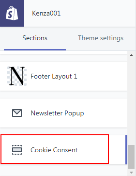
To configure Cookie Consent, navigate to Customizer > Cookie Consent and configure required fields.
| # | Parameter | Value | Description |
| 1 | Enabled | True / False | Check if you want to enabled cookie consent of the Store. |
| 2 | Position | Select | Select position for the cookie consent. Available options are Bottom or Left or Right. |
| 3 | Description | Text | Configure the description of cookie consent. |
| 4 | Button Text | Text | Configure the text of the button. |
| 5 | Background Color | Color | Configure the background color for the cookie consent. |
| 6 | Background Opacity | Number | Configure the background opacity for the cookie consent. |
| 7 | Button Background Color | Color | Configure the button background color for the cookie consent. |
| 8 | Button Text Color | Color | Configure the button text color for the cookie consent. |
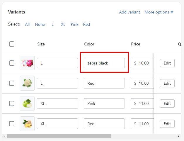
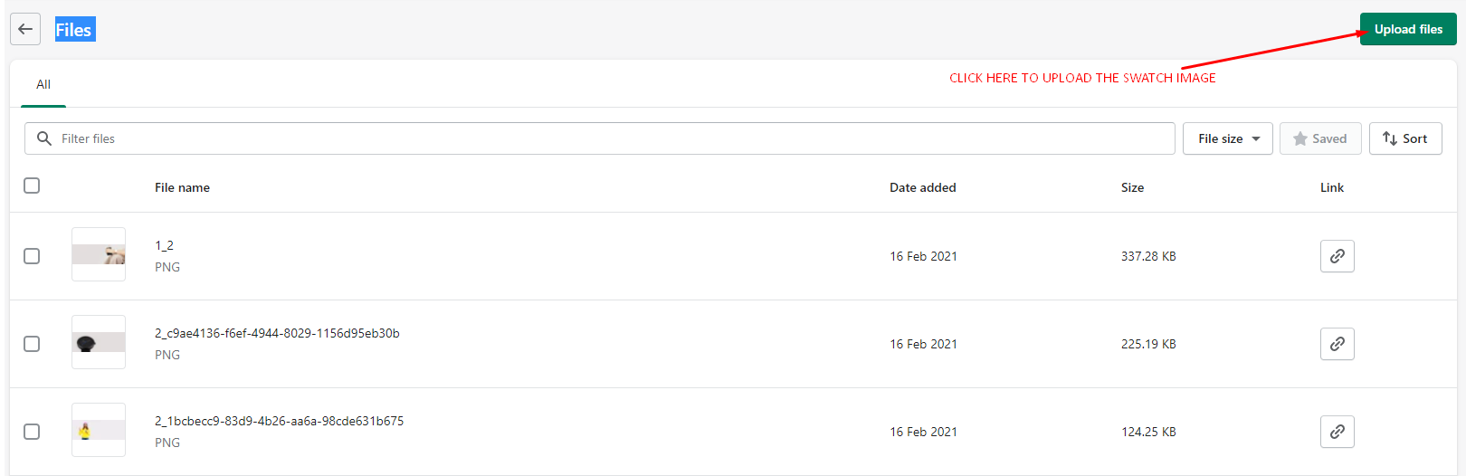
Our themes provide a color swatch feature on product page. Color swatch replace the traditional dropdown for variant options of type color. However, if you are using some color names that are non standard (like "zebra black", or "denim blue" for instance), you will realize the color swatch appears white. This is because the theme can't guess which color to display. To make it work, you will need to create your small image and upload them. You will find below detailed instructions about how to do it.
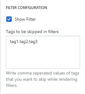
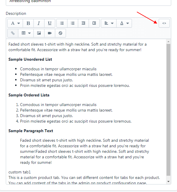
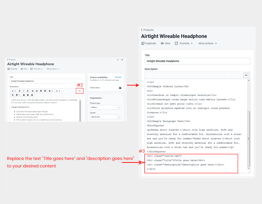
<div class="custom-tab">

							<div class="title">Title goes here.</div>

							<div class="description">Description goes here.</div>

							</div>
Social Media