Theme Documentation

Thank you! We are glad that you have choosen us.

For Queries / Customisation requests, feel free to contact us.

This is our enhanced and beautifully designed responsive Shopify theme for your online Store. Theme has rich and powerful userfriendly features that would attract more clients to your online store and boost sales!

Here are some basics on installing, configuring and customizing the theme that will get you started! This document is written very carefully by keeping mind Beginners, advanced users and developers.

If you are new to shopify. Please read SHOPIFY GUIDE first and then get along with the theme document.

Theme Installation

  1. Extract the zip file downloded from Themeforest. Extracting the zip will create following folders :
    • Documentation : Contains information about theme installation and setup.
    • Licensing : Contains all the files related to licensing.
    • PSD_Files : PSD files of the theme to help you with modifications and banner designs!
    • upload_me_Theme.zip : This is the default zip file to be uploaded to shopify.
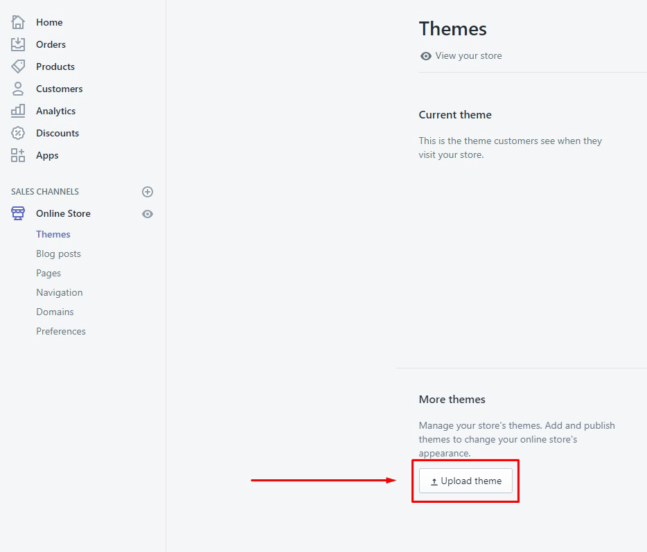
  2. Open your Shopify back office, then Online Store -> Themes on the left side bar.
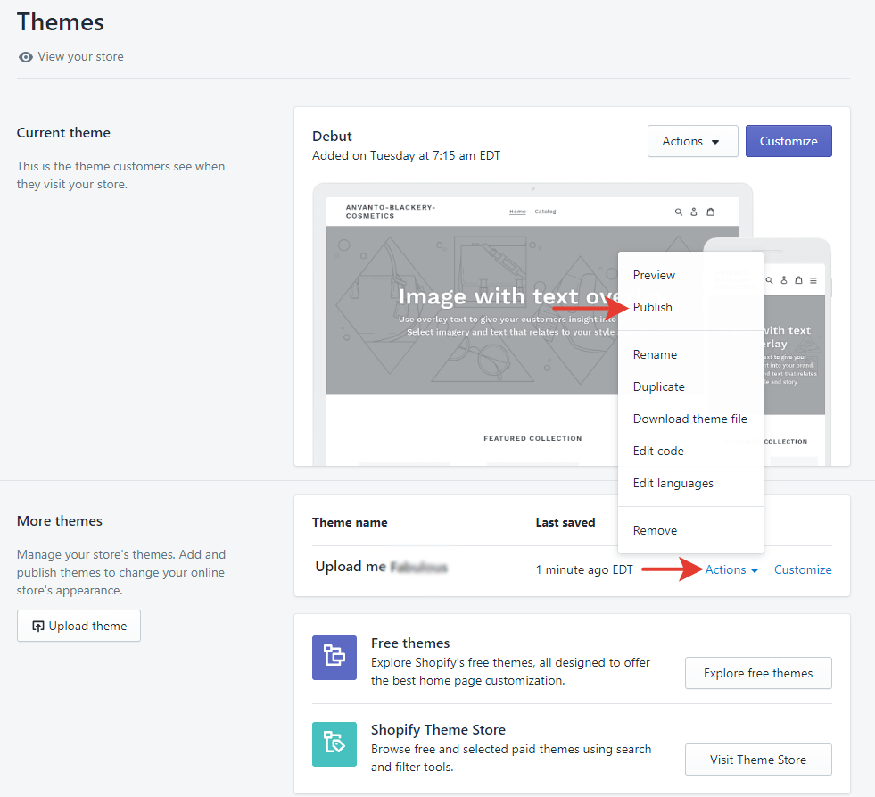
  3. Press Upload theme and select the "upload_me_Theme.zip" file.
  4. Navigate to the Theme Library section and click on Upload Theme

Updating Theme

To update the theme without loosing your data please follow these steps :

  1. Create copy of you current theme. Online store -> Themes -> Actions -> Duplicate.
  2. Download your current theme.
  3. Unzip your current theme. Name theme's folder "Theme-Current"
  4. Download latest theme version. Unzip latest theme. Name it "Theme-Latest".
  5. Copy files with extension ".json" from current theme to latest theme. Here are a few examples of json files. They are usually located in the "templates" folder of your theme.
    • settings_data.json
    • 404.json
    • article.json
    • blog.json
    • cart.json
    • collection.json
    • index.json
    • list-collections.json
    • product.json
    • page.aboutus.json
    • page.contact.json
    • page.faq.json

    Note : There could be many other json files depending upon your customisations and theme. You must make sure you copy all those json files.

  6. Zip "Theme-Latest".
  7. Upload "Theme-Latest.zip" to your store at Online store -> Themes -> Upload theme.
  8. Reinstall apps.

Install Apps

The theme comes with free apps which can be installed as per your use.

Product Reviews app

  1. To enable product review, Install Product Reviews App
  2. Press "Add App" button and proceed with general app installation procedure.
  3. Once you are done with basic app setup, the app is ready to use.

Basic Store Configuration

Multiple Currencies

Edit your Shopify Payments settings to enable selling in multiple currencies, and then add a currency selector to your online store's theme.

Before you start selling in multiple currencies, test your customer's experience. Shopify supports two currency values (store and customer) instead of one, to sell in multiple currencies.
    Set up Shopify Payments to use multiple currencies
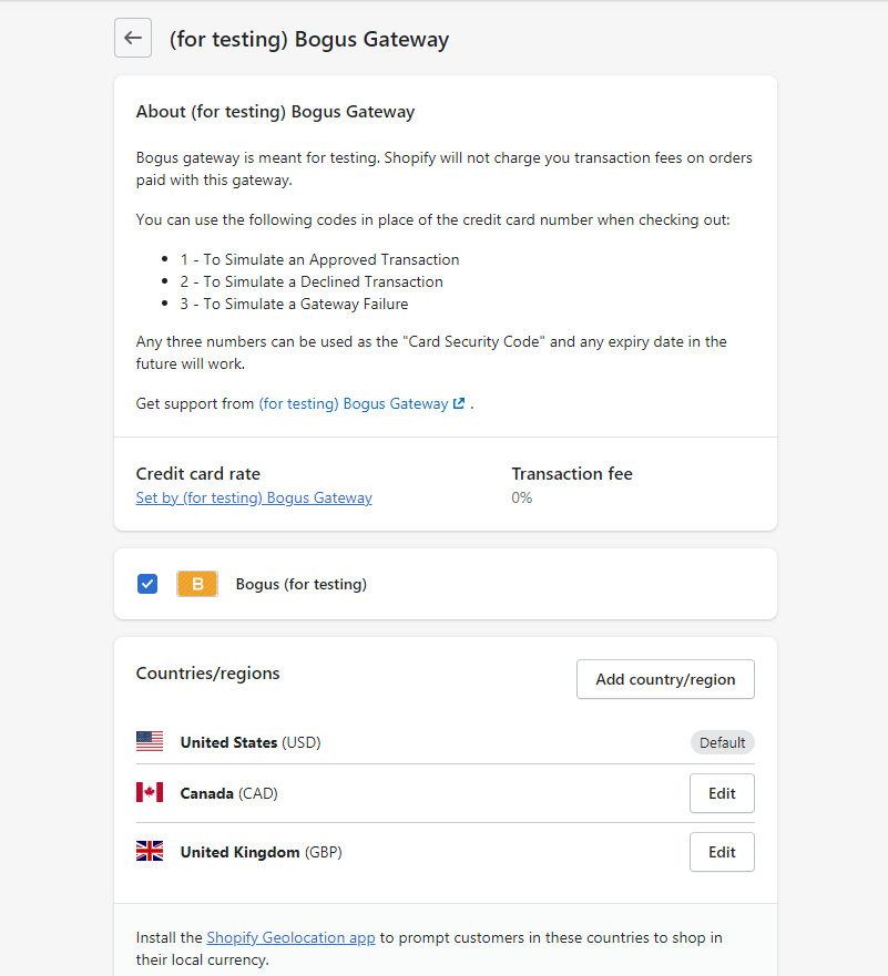
  1. From your shop admin, go to the Settings / Payments
  2. In the Shopify Payments section, click Manage.
  3. In the Countries/regions section, click Add country/region.
  4. Select the country or region that you want to support from the list of supported countries and regions.
  5. Click Add country/region.
  6. Enable a currency selector on the store front

    You can enable currency selector from the header configuration of your shopify theme. The detailed steps are mentioned in the Header Section Documentation below.

Multiple Languages

Customers all over the world enjoy viewing content in their native language. Translating your store's content can lead to more sales because your international customers can better understand your marketing, product details, shipping, and return policies.

You can enable multiple languages from your Shopify admin to create separate URLs for your translated content. When customers land on a translated URL, your store automatically shows the translated version if translations exist. Whenever translations don't exist, your online store shows content in your primary language.


    Add new languages
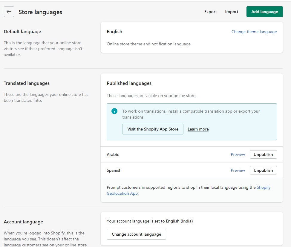
  1. From your Shopify admin, go to Settings / Store Languages
  2. In Translated languages, click Add Language.
  3. Choose a language from the drop-down menu, then click Add.
  4. Click Visit Shopify App Store and follow the steps to install a translation app to your store.
  5. Follow the steps in the app to translate your online store's content and publish new languages.
  6. Click Preview to view different languages in your online store. You can preview both published and unpublished languages.
  7. In Translated languages, click Publish language to make any of your translations available in your store. Click Unpublish language to remove any language you don't want available in your store. Click Delete to delete all translated content of a language from your online store.
  8. Enable a language selector on the store front

    You can enable language selector from the header configuration of your shopify theme. The detailed steps are mentioned in the Header Section Documentation below.

Checkout Settings

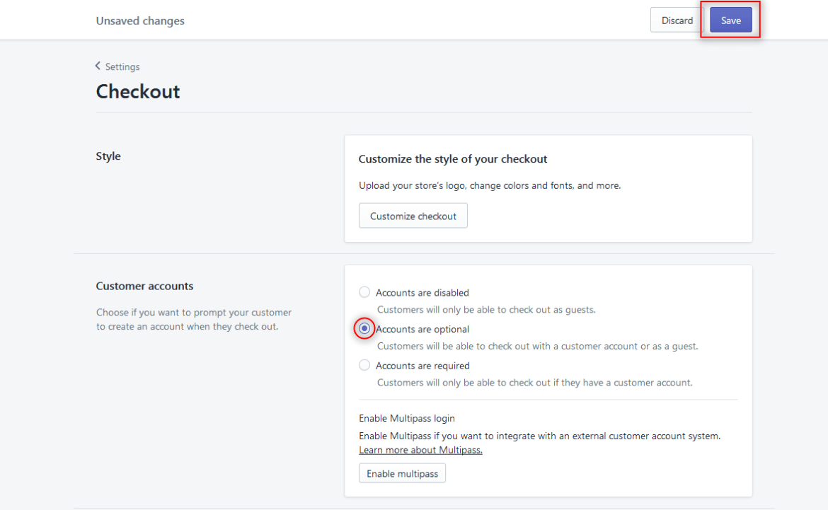
  1. From your shop admin, go to the Settings / Checkout
  2. You can allow/deny the customer account creation. You can also keep it optional.Generally, setting must be set to "Accounts are optional"

Product Import

  1. Online Store > Product
  2. Click Import.
  3. Click Add file, and then select the CSV file that you want to import.

Theme Settings

It allows you to configure general theme settings like Product, Colors, Fonts and various other options

Color

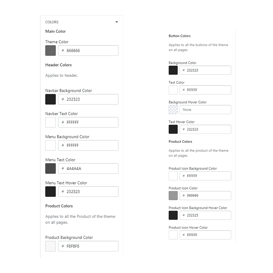
  1. Go to Customizer > Theme Settings > Colors
  2. Configure Header, Footer, Basic Theme Color, Button Colors and Product Icon Colors as per requirement.

Typography

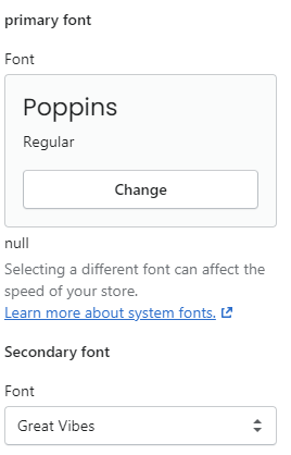
  1. Go to Customizer > Theme Settings > Typography
  2. Configure Fonts as per your requirements.
  3. You can choose from several fonts for the text in your online store. You can use a system font. A system font is a font that is already installed on most computers. You can select a mono, serif, or sans-serif font family. You can still use font styles, such as bold or italic, when you use any of these font families.

Cart Drawer

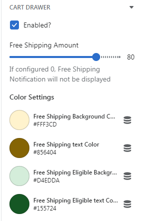
  1. Go to Customizer > Theme Settings > Cart Drawer
# Parameter Value Description
1 Enabled True / False Check if you want to enabled Cart Drawer of the Store.
2 Free Shipping Amount Number Configure the Free Shipping Amount of the Cart Drawer.
3 Free Shipping Background Color Color Configure the Free Shipping Background Color of Cart Drawer.
4 Free Shipping text Color Color Configure the Free Shipping Text Color of Cart Drawer.
5 Free Shipping Eligible Background Color Color Configure the Free Shipping Eligible Background Color of Cart Drawer.
6 Free Shipping Eligible text Color Color Configure the Free Shipping Eligible Text Color of Cart Drawer.
reassurance Slider
7 Image Image Configure the image for the slider.
8 Title Text Configure the Title for the slider.
9 Sub Title Text Configure the Sub Title for the slider.

Product

  1. Go to Customizer > Theme Settings > Product
  2. # Parameter Value Description
    1 Image Ratio Select Select Image Ratio. The size of the product images will change based on the choosen style.
    2 Show Second Image on Hover True/False Check if you want to show second product image on hover.
    3 Show Vendor True/False Check if you want to show vendor.
    4 Length of Characters for Short Product Description Text Configure the length of characters for product description.
    5 Variant Picker Select Select Variant style. The available style is Dropdown or Swatches.
    6 Show Quickview True/False Check if you want to show quickview.
    7 Show Wishlist True/False Check if you want to show wishlist.
    8 Show Add To Cart True/False Check if you want to show add to cart.
    9 Show Sale Badge True/False Check if you want to show sale badge.
    10 Background color Color Configure the background color of sale badge.
    11 Text color Color Configure the text color of sale badge.
    12 Show Sold out Badge True/False Check if you want to show sold out badge.
    13 Background color Color Configure the background color of sold out badge.
    14 Text color Color Configure the text color of sold out badge.

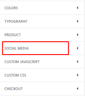
Social Media

  1. Go to Customizer > Theme Settings > Social Media
  2. Configure your desired social links. These social links are generally displayed in the store's footer.

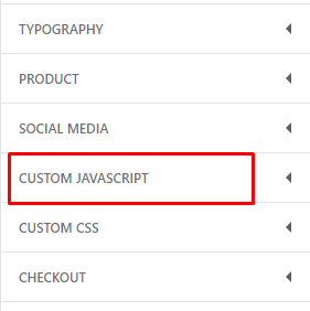
Custom Javascript

  1. Go to Customizer > Theme Settings > Custom Javascript
  2. Configure custom javascript code here.

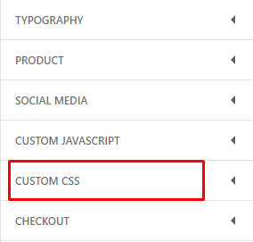
Custom CSS

  1. Go to Customizer > Theme Settings > Custom CSS
  2. Configure custom CSS code here.

Setup Pages

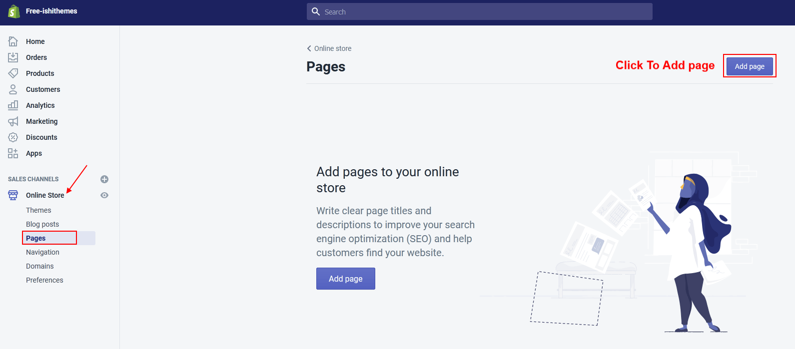
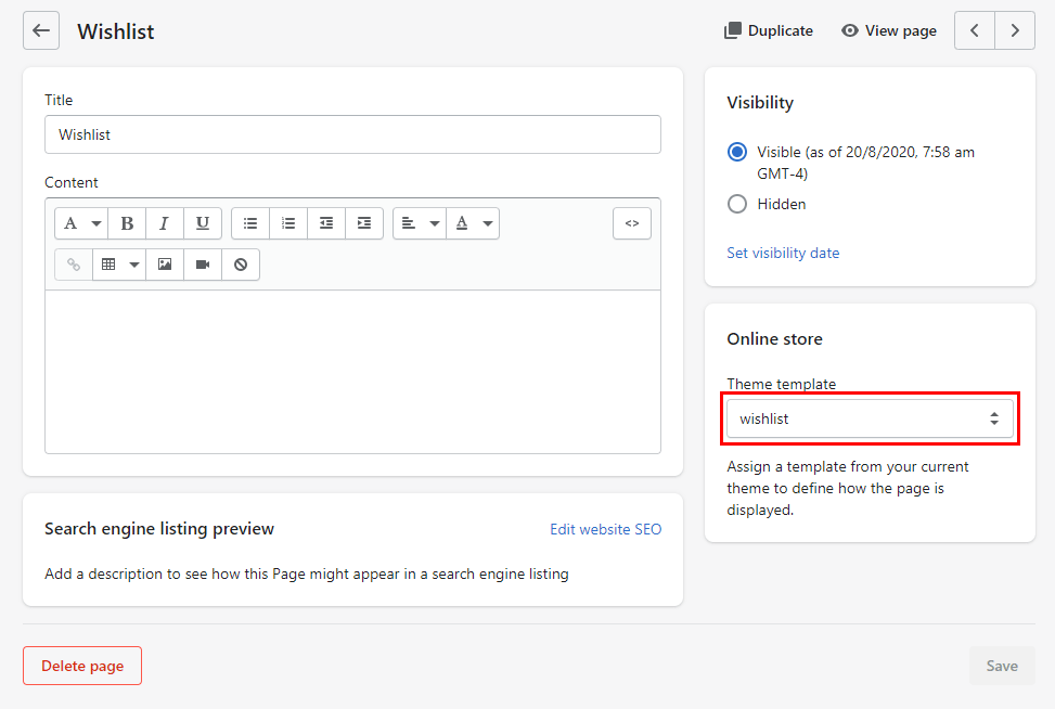
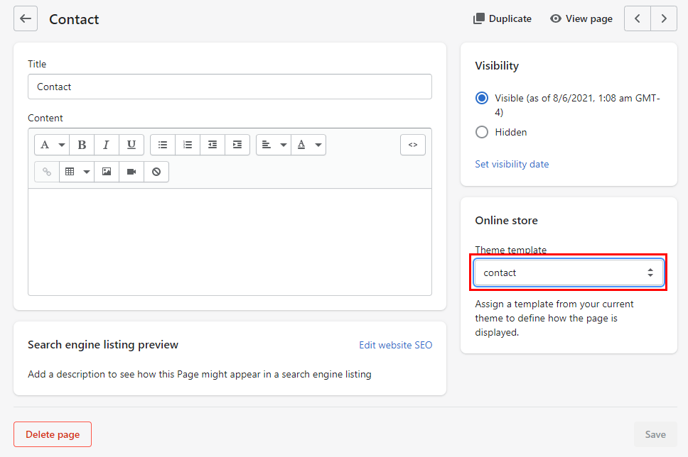
Online Store > Pages click button "Add a page"

Wishlist Page

  1. Configure Title of the page "WishList".
  2. Select Visibility: Visible
  3. Select Template: page.wishlist

Contact Us Page

  1. Configure Title of the page "Contact us".
  2. Select Visibility: Visible
  3. Select Template: page.contact

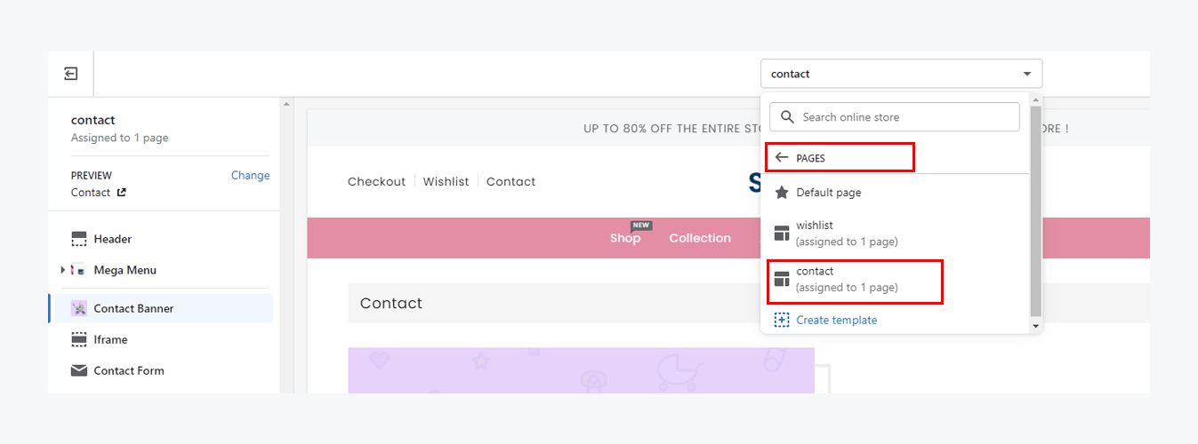
To configure contact us page, navigate to Customizer > Contact Us Page and configure required fields.

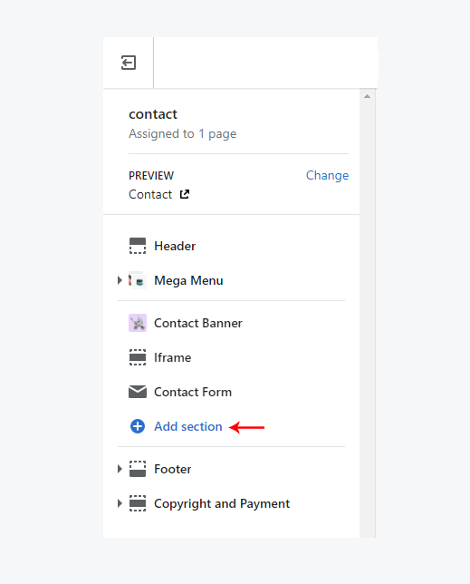
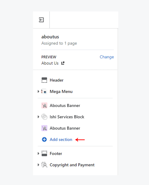
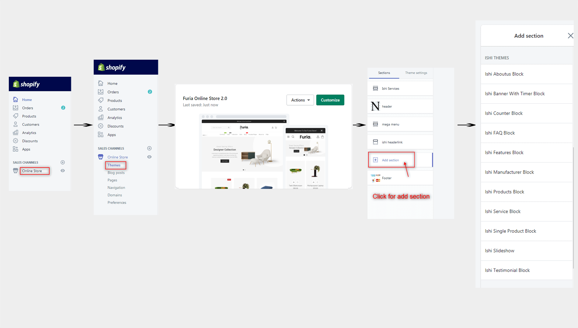
The default sections are added by default. You can click on "Add Section" to add sections as you want.

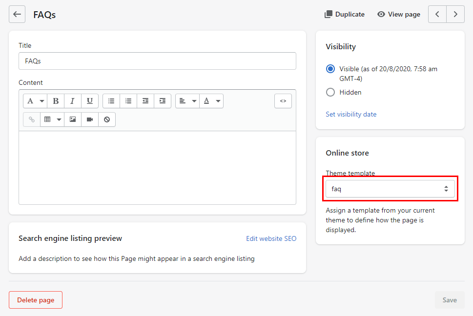
FAQ Page

  1. Configure Title of the page "FAQ".
  2. Select Visibility: Visible
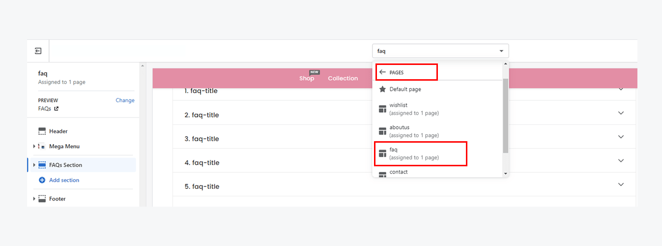
  3. Select Template: page.faq

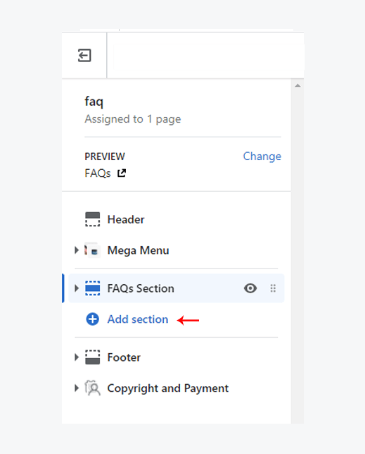
To configure FAQ page, navigate to Customizer > FAQ Page and configure required fields.

The default sections are added by default. You can click on "Add Section" to add sections as you want.

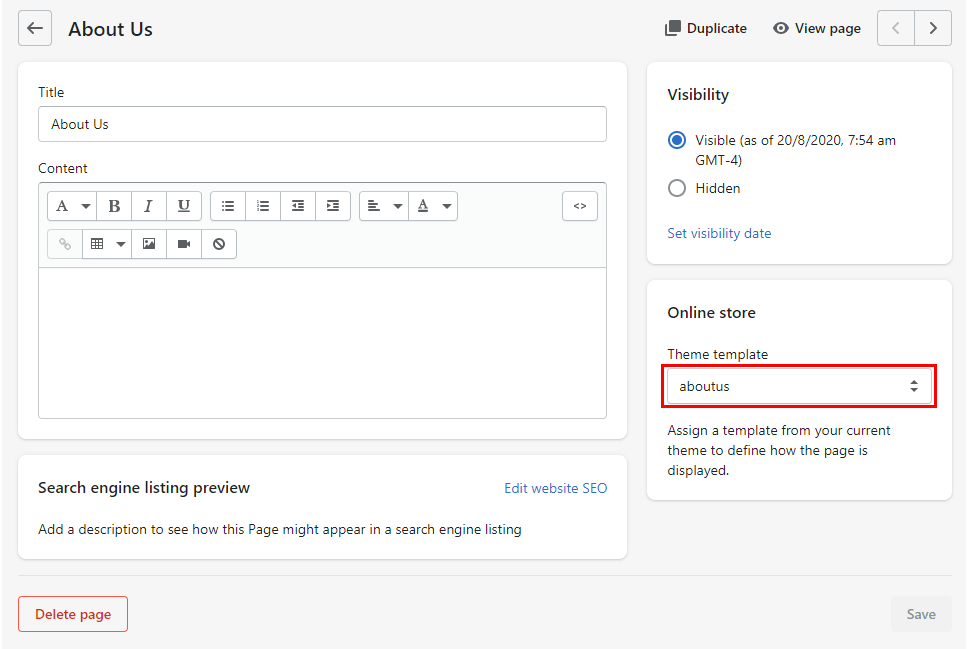
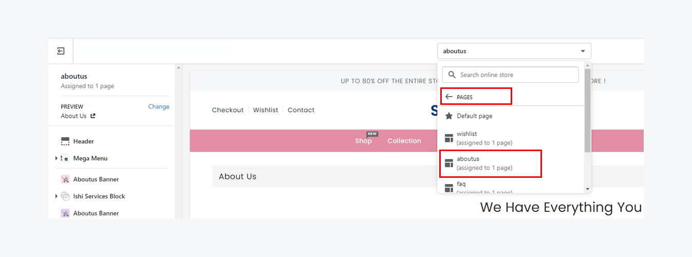
About Us Page

  1. Configure Title of the page "About Us".
  2. Select Visibility: Visible
  3. Select Template: page.aboutus

To configure About Us page, navigate to Customizer > About Us Page and configure required fields.

The default sections are added by default. You can click on "Add Section" to add sections as you want.

Sidebar

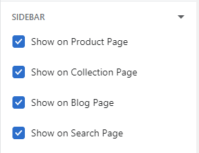
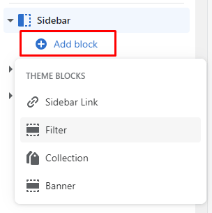
Sidebar is a left column which can be added to the Collection, Product, Blog or Search page. You can add various blocks to the sidebar depending upon your requirements and settings.

  1. To enable a sidebar Go to Customizer > Theme Settings > Sidebar
  2. Following screenshot shows a list of pages to which you can add the sidebar. You can check the boxes to add the sidebar to a page
  1. To configure a sidebar Go to Customizer > Select Page which you enable on theme settings. For example you checked Product page to show sidebar then go to the product page.
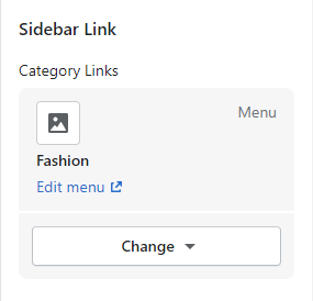
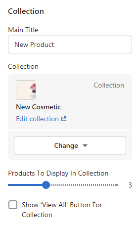
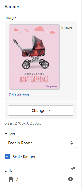
  2. These are the available blocks you can use and explained below.
# Parameter Value Description
1 Select Category Links Select Select a menu for Category Links.

Collection:

# Parameter Value Description
1 Main Title Text Configure main title of the block.
2 Collection Select Configure the collection to be shown.
3 Product To Display In Collection Number Configure total number of products that should be fetched from the collection.
4 Show View All Button True/False Check if you want to show view all button.
# Parameter Value Description
1 Banner Image Image Configure the image of the banner.
2 Hover Select Select the hover that should be applied when customer hovers on the banner.
3 Scale Banner True/False Check if you want the banner to zoom on hover.
4 Link URL Configure the URL to which customer should be redirected on clicking the banner.

Theme Sections

Go to Customizer > Sections > Add Section.

Header

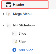
To configure Header, navigate to Customizer > Header and configure required fields.

  1. Configure required parameters of header.
# Parameter Value Description
1 Primary Logo Image Configure the logo of the store here.
2 Secondary Logo Image Secondary Logo is visible only on the top of the homepage and nowhere else.
3 Max Logo Width Number Configure the max size of the logo in pixels.
4 Enable Currency selector True / False Check if you want to enable currency selector in the header.
5 Enable language selector True / False Check if you want to enable language selector in the header.
Content (Offer)
6 Offer Text Text Write your annoucements like sale, introductory offers etc.
7 Link URL Configure the URL to which customer should be redirected on clicking the offer.

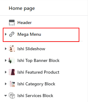
Mega Menu

To configure Mega Menu, navigate to Customizer > Mega Menu and configure required fields.

Creating a Navigation

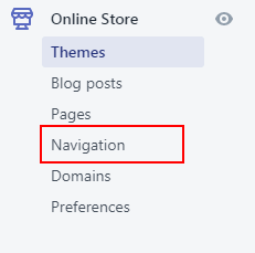
  1. Go to Online store -> Navigation.
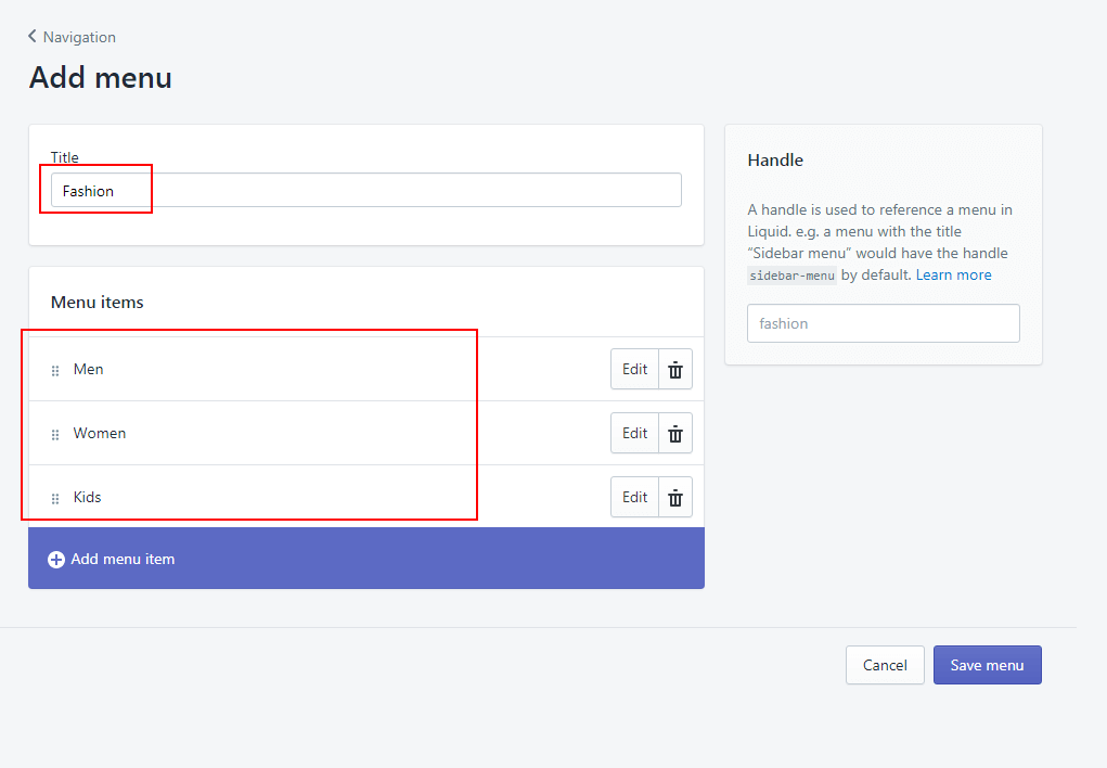
  2. Click on "Add Menu" to create a new menu
  3. Enter menu title and add menu items.

Creating a menu without a dropdown.

  1. Navigate to Customizer > Mega Menu.
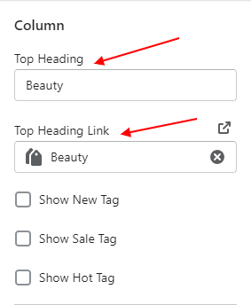
  2. Click on "Add Column".
  3. Enter Top Heading and Top Heading Link. You can also show flags like New, Hot, Sale by selecting these options below the link.
  4. Click on Save. This will create a simple link on the mega menu.

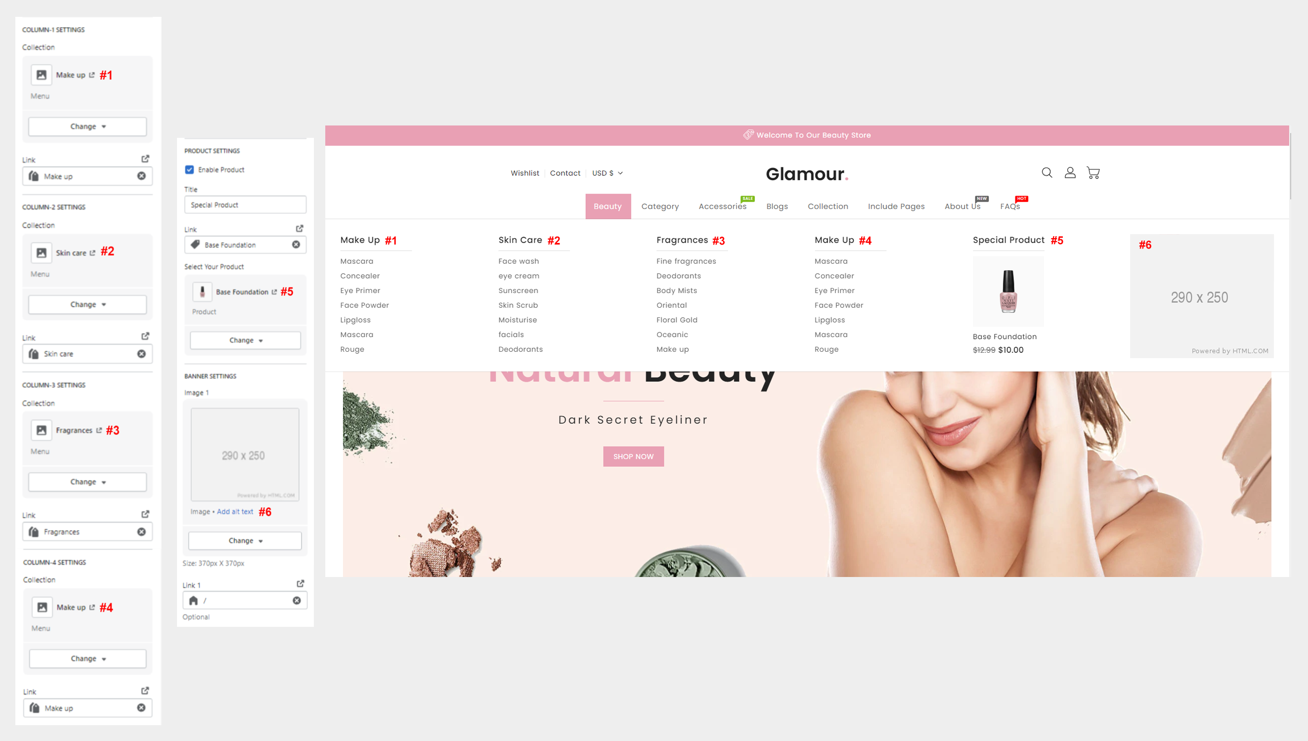
Creating a menu with a dropdown links and images.

  1. Navigate to Customizer > Mega Menu.
  2. Click on "Add Column".
  3. Refer following image to configure each links, images or products on the dropdown. If something is not configured, it will not appear on the dropdown
  4. Click on Save. This will create a simple link on the mega menu.

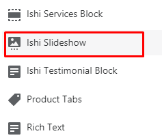
Ishi Slideshow

Shows slides of images usually below the header. There are various options available. Each of them are described below.

To configure Simple Slider, navigate to Customizer > Simple Slider and configure required fields.

  1. Configure required parameters of Simple Slider.
# Parameter Value Description
1 Desktop Bottom Margin Number Configure the space between the current section and the following section on desktop version.
2 Mobile Bottom Margin Number Configure the space between the current section and the following section on mobile version.
Content (Slider)
Desktop Version
3 Image Image Configure the image for the slider.
4 Text Position Select Select Text Position. The Design of the section will change based on the chooen style.
5 Text Alignment Select Select Text Alignment. The Design of the section will change based on the chooen style.
6 Sub Title Text Configure the sub title for the slider.
7 Sub Title Color Color Configure the text color of the sub title.
8 Title Text Configure the title for the slider.
9 Title Color Color Configure the text color of the title.
10 Description Text Configure the description for the slider.
11 Description Color Color Configure the text color of the description.
12 Button Label Text Configure the label of the button.
13 Link URL Configure the URL to which customer should be redirected on clicking the slider.
Mobile Version
14 Image Image Configure the image for the slider.
15 Text Position Select Select Text Position. The Design of the section will change based on the chooen style.
16 Text Alignment Select Select Text Alignment. The Design of the section will change based on the chooen style.

Ishi Products Timer Block

You can add products into a collection and configure the collection in this section to show up products.

To configure Ishi Products Timer Block, navigate to Customizer > Ishi Products Timer Block and configure required fields.

  1. Configure required parameters of Ishi Products Timer Block.
# Parameter Value Description
1 Collection Select Configure the collection to be shown.
2 Total Product From Collection Number Configure total number of products that should be fetched from the collection.
3 Main Title Text Configure main title of the section.
4 Description Text Configure description of the section.
5 Start Date Text Configure the starting date of the product timer in the YYY-MM-DD format.
6 End Date Text Configure the ending date of the product timer in the YYY-MM-DD format.
7 Button Label Text Configure the label of the button.
8 Button Link URL Configure the URL to which customer should be redirected on clicking the section.
9 Desktop Bottom Margin Number Configure the space between the current section and the following section on desktop version.
10 Mobile Bottom Margin Number Configure the space between the current section and the following section on mobile version.

Ishi Services With Video

It displays basic services offerd by the store like free delivery, easy returns, cashbacks and other services that could benefit the customers.

To configure Ishi Services With Video, navigate to Customizer > Ishi Services With Video and configure required fields.

  1. Configure required parameters of Ishi Services With Video.
# Parameter Value Description
1 Main Title Text Configure main title of the section.
2 Description Text Configure description of the section.
3 Button Label Text Configure the label of the button.
4 Button Link URL Configure the URL to which customer should be redirected on clicking the section.
5 Video Image Image Configure the video image for the section.
6 Image Link URL Configure the URL to which customer should be redirected on clicking the Image.
7 Video Link URL Configure the URL to which customer should be redirected on clicking the video.
Content (Service)
8 Service Image Image Configure the icon for the service.
9 Title Text Configure the heading of the service.
10 Sub Title Text Configure the sub title of the service.
11 Link URL Configure the URL to which customer should be redirected on clicking the service.
12 Desktop Bottom Margin Number Configure the space between the current section and the following section on desktop version.
13 Mobile Bottom Margin Number Configure the space between the current section and the following section on mobile version.

Ishi Product Block

You can add products into a collection and configure the collection in this section to show up products.

To configure Ishi Product Block, navigate to Customizer > Ishi Product Block and configure required fields.

  1. Configure required parameters of Ishi Product Block.
# Parameter Value Description
1 Main Title Text Configure main title of the section.
2 Maximum Products to Show Number Configure total number of products that should be fetched from the collection.
3 Number of Column Select Select number of column to products show in one row.
4 Enable Swipe on Mobile True/False Check if you want to show slider on mobile.
5 Desktop Bottom Margin Number Configure the space between the current section and the following section on desktop version.
6 Mobile Bottom Margin Number Configure the space between the current section and the following section on mobile version.
Content (Product Block)
7 Product Tab Title Text Configure the tab title of the block
8 Collection Select Configure the collection of products to be shown.
9 Show View All Button True / False Check if you want to show view all button which redirects user to collection page on click.

Ishi Parallax Block

Shows banners and specification on the store.

To configure Ishi Parallax Block, navigate to Customizer > Ishi Parallax Block and configure required fields.

  1. Configure required parameters of Ishi Parallax Block.
# Parameter Value Description
1 Background Image Image Configure the background image of the section.
2 Background color Color Configure the background color of the section. It is visible only if background image is not configured.
3 Text Background Color Color Configure Text Background of the section.
4 Text Color1 Color Configure primary text color of the section.
5 Text Color2 Color Configure the secondary text color of the section.
6 Button backgraound Color Color Configure Button backgraound Color of the section.
7 Button Text Color Color Configure Button Text Color of the section.
8 Parallax Offer Title Text Configure offer title of parallax block.
9 Parallax Title Text Configure main title of parallax block.
10 Parallax Sub Title Text Configure the sub title of the parallax block.
11 Start Date Text Configure the starting date of the parallax timer in the YYY-MM-DD format.
12 End Date Text Configure the ending date of the parallax timer in the YYY-MM-DD format.
13 Button Label Text Configure the label of the button
14 Button Link URL Configure the URL to which customer should be redirected on clicking the button.
15 Desktop Bottom Margin Number Configure the space between the current section and the following section on desktop version.
16 Mobile Bottom Margin Number Configure the space between the current section and the following section on mobile version.

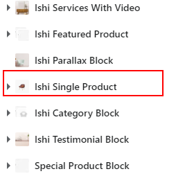
Ishi Single Product Block

It helps you to show a featured product on the home page of your stores. It shows all the details of products like description, reviews, custom tabs etc.

To configure Ishi Single Product Block, navigate to Customizer > Ishi Single Product Block and configure required fields.

  1. Configure required parameters of Ishi Single Product Block.
# Parameter Value Description
1 Enable Sticky Product Image True/False Check if you want product image to sticky.
2 Enable Video Looping True/False Check if you want to play video continuously.
3 Sub Title Text Configure the sub title of the section.
4 Main Title Text Configure the main title of the section.
5 Select Your Product Select Configure the Product to be shown.
Custom Tab Configuration
6 Show Description Tab True/False Check if you want to show product description tab.
7 Show Review Tab True/False Check if you want to show product review tab.
8 Show Conatct Tab True/False Check if you want to show contact tab.
9 Custom Tab1 Title Text Configure custom tab1 title.
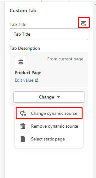
10 Custom Tab1 Description Text Select page for custom tab1 description. You can also add dynamic source using metafields.
11 Custom Tab2 Title Text Configure custom tab2 title.
12 Custom Tab2 Description Text Configure custom tab2 description. You can also add dynamic source using metafields.
13 Desktop Bottom Margin Number Configure the space between the current section and the following section on Desktop version.
14 Mobile Bottom Margin Number Configure the space between the current section and the following section on Mobile version.

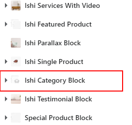
Ishi Category Block

Displays images with titles as a slider on the store. You can add as many images you want.

To configure Ishi Category Block, navigate to Customizer > Ishi Category Block and configure required fields.

  1. Configure required parameters of Ishi Category Block.
# Parameter Value Description
1 Main Title Text Configure the main title of the section.
2 Length of Characters for Short Category Description Number Configure the length of characters for Category description..
Content (Product Block)
3 Category Image Image Configure the image for the category.
4 Collection Select Configure the collection to be shown.
5 Button Label Text Configure the label of the button
6 Desktop Bottom Margin Number Configure the space between the current section and the following section on desktop version.
7 Mobile Bottom Margin Number Configure the space between the current section and the following section on mobile version.

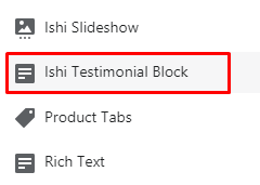
Ishi Testimonial Block

Displays client reviews on the homepage of your store. You can add client's image, name, designation and their short review.

To configure Ishi Testimonial Block, navigate to Customizer > Ishi Testimonial Block and configure required fields.

  1. Configure required parameters of Ishi Testimonial.
# Parameter Value Description
1 Background Image Image Configure the background image of the section.
2 Background color Color Configure the background color of the section. It is visible only if background image is not configured.
3 Text Background Color Color Configure Text Background of the section.
4 Title Color Color Configure Title color of the section.
5 Text Color1 Color Configure the primary text color of the section.
6 Text Color2 Color Configure the secondary text color of the parallax section.
7 Main Title Text Configure main title of the Section.
Content (Testimonial)
8 Image Image Configure the image for the testimonial.
9 Name Text Configure the name for testimonial.
10 Profession Text Configure the Profession for testominal.
11 Text Text Enter the description for the testimonial.
12 Desktop Bottom Margin Number Configure the space between the current section and the following section on desktop version.
13 Mobile Bottom Margin Number Configure the space between the current section and the following section on mobile version.

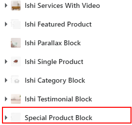
Ishi Special Product Block

Displays the product collections in the form of tabs. You can add products into a collection and configure the collection in this section to show up products.

To configure Ishi Special Product Block, navigate to Customizer > Ishi Product Block and configure required fields.

  1. Configure required parameters of Special Product Block.
# Parameter Value Description
1 Main Title Text Configure main title of the section.
2 Maximum Products to Show Number Configure total number of products that should be fetched from the collection.
3 Number of Column Select Select number of column to products show in one row.
4 Enable Swipe on Mobile True/False Check if you want to show slider on mobile.
5 Desktop Bottom Margin Number Configure the space between the current section and the following section on desktop version.
6 Mobile Bottom Margin Number Configure the space between the current section and the following section on mobile version.
Content (Product Block)
7 Product Tab Title Text Configure the tab title of the block
8 Collection Select Configure the collection of products to be shown.
9 Show View All Button True / False Check if you want to show view all button which redirects user to collection page on click.

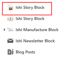
Ishi Story Block

Allows you to configure description of the store or story behind the store. You can also use it for any other purpose.

  1. Configure required parameters of Ishi Story Block.
# Parameter Value Description
1 Image Image Configure the image for the story block.
2 Image Position Select Select image position for the story block. Available options are Left or Right.
3 Main Title Text Configure the main title of the story block.
4 Description Text Configure the description of the story block.
5 Button Label URL Configure the label of the button.
6 Button Link URL Configure the URL to which customer should be redirected on clicking the button.
7 Desktop Bottom Margin Number Configure the space between the current section and the following section on desktop version.
8 Mobile Bottom Margin Number Configure the space between the current section and the following section on mobile version.

Ishi Manufacturer Block

To configure Ishi Manufacturer Block, navigate to Customizer > Ishi Manufacturer Block and configure required fields.

  1. Configure required parameters of Ishi Manufacturer Block.
# Parameter Value Description
1 Desktop Bottom Margin Number Configure the space between the current section and the following section on desktop version.
2 Mobile Bottom Margin Number Configure the space between the current section and the following section on Mobile version.
Content (Manufacturer Logo)
3 Brand Logo Image Image Configure the image of the Manufacturerr Logo.
4 Link URL Configure the URL to which customer should be redirected on clicking the Manufacturerr Logo.

Ishi Newsletter Block

To configure Ishi Newsletter Block, navigate to Customizer > Ishi Newsletter Block and configure required fields.

  1. Configure required parameters of Ishi Newsletter Block.
# Parameter Value Description
1 Background Image Image Configure the background image for the section.
2 Background Color Color Configure the background color of the section. It appears only when background image is not selected.
3 Text Color1 Color Configure the primary text color of the section.
4 Text Color2 Color Configure the secondary text color of the section.
5 Top & Bottom Internal Padding Number Configure top and bottom internal padding of the section.
6 Background Attachment Fixed ? True/false Check if you want to keep the background sticky on scroll.
7 Title Text Configure main title of Newsletter Block.
8 Description Text Configure the Description of the Newsletter Block.
9 Show Social Icon True / False Check if you want to show social icon in Newsletter Block.
10 Desktop Bottom Margin Number Configure the space between the current section and the following section on desktop version.
11 Mobile Bottom Margin Number Configure the space between the current section and the following section on mobile version.

Blog Post

Displays a few blogs on the home page of your store.

To configure Blog Post, navigate to Customizer > Blog Post and configure required fields.

  1. Configure required parameters of Blog Post.
# Parameter Value Description
1 Main Title Text Configure the main title of the BLOG section.
2 Blog blogs Select the blogs that you would like to display on the homepage.
3 Post Number Configure the number of posts that you would like to show.
4 Show Author True / False Check if you want to show up the author name on the blog.
5 Show Date True / False Check if you want to show crated date of the blog.
6 Show Comment True / False Check if you want to show number of conmments on the blog.
7 Show View All Button True / False Check if you want to show view all button on the blog.

Custom HTML Block

To configure Custom HTML Block, navigate to Customizer > Custom HTML Block and configure required fields.

  1. Configure required parameters of Custom HTML Block.
# Parameter Value Description
1 HTML Layout Select Select layout. The available options are Box or Full.
2 Custom HTML HTML Configure the Required HTML Code.
3 Desktop Bottom Margin Number Configure the space between the current section and the following section on desktop version.
4 Mobile Bottom Margin Number Configure the space between the current section and the following section on mobile version.

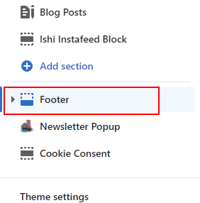
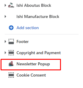
Newsletter Popup

To configure Newsletter Popup, navigate to Customizer > Newsletter Popup and configure required fields.

  1. Configure required parameters of Newsletter Popup.
# Parameter Value Description
1 Enabled True / False Check if you want to enabled Newsletter Popup of the Store.
2 Show All Pages True / False Check if you want to show Newsletter Popup of all pages on a store.
3 Set Timeout Number Configure the delay time for Newsletter Popup.
4 Background Image Image Configure the background image for Newsletter Popup.
5 Background Color Color Configure the background color for Newsletter Popup. It appears only when background image is not selected.
6 Text Color Color Configure the text color for Newsletter Popup.
7 Image Position Select Select Image position for the Newsletter Popup. Available options are Cover or Left or Right.
8 Text Position Select Select Text position for the Newsletter Popup. Available options are Center or Left or Right.
9 Main Title Text Configure the Main Title of Newsletter Popup.
10 Sub Title Text Configure the sub title of the Newsletter Popup.
11 Show Social Icon True / False Check if you want to show social icon of Newsletter Popup.

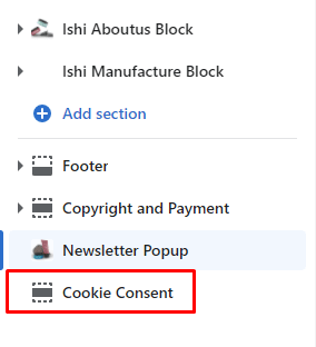
Cookie Consent

To configure Cookie Consent, navigate to Customizer > Cookie Consent and configure required fields.

  1. Configure required parameters of Cookie Consent.
# Parameter Value Description
1 Enabled True / False Check if you want to enabled cookie consent of the Store.
2 Position Select Select position for the cookie consent. Available options are Bottom or Left or Right.
3 Description Text Configure the description of cookie consent.
4 Button Text Text Configure the text of the button.
5 Background Color Color Configure the background color for the cookie consent.
6 Background Opacity Number Configure the background opacity for the cookie consent.
7 Button Background Color Color Configure the button background color for the cookie consent.
8 Button Text Color Color Configure the button text color for the cookie consent.

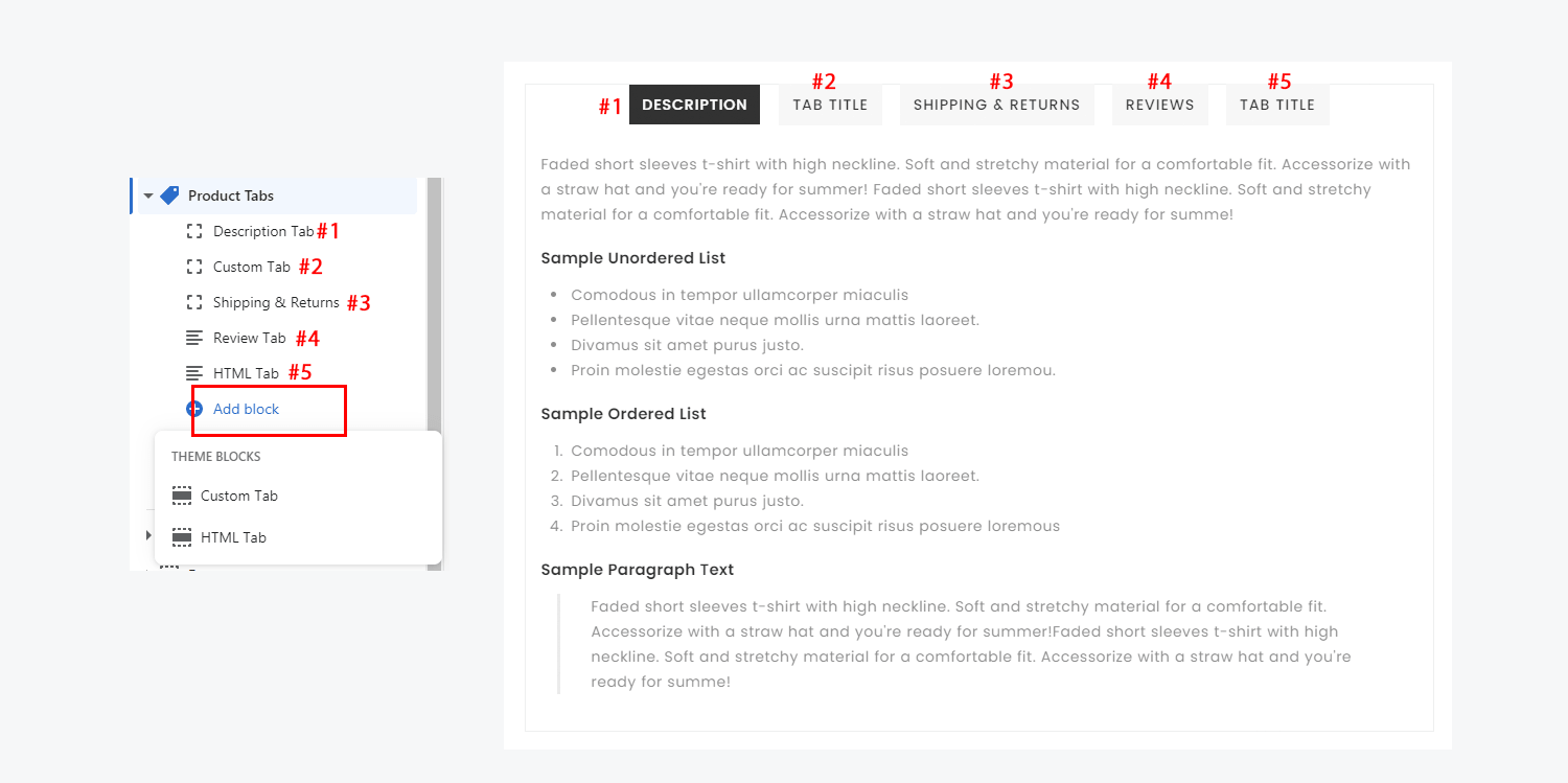
Product Tab

  1. Go to Customizer > Product Page > Product Tabs
  2. You can add multiple tabs as you want. The available tabs are Description Tab, Review Tab, Custom Tab, HTML Tab. Description Tab shows product description. Review Tab shows product reviews. Custom and HTML Tab shows custom content. In Custom Tab you can select any page which are available on your store. In HTML Tab you can write any HTML content.

Product Swatches

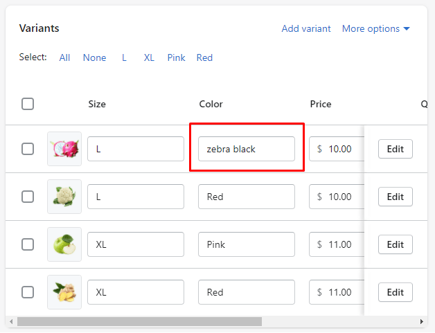
Our themes provide a color swatch feature on product page. Color swatch replace the traditional dropdown for variant options of type color. However, if you are using some color names that are non standard (like "zebra black", or "denim blue" for instance), you will realize the color swatch appears white. This is because the theme can't guess which color to display. To make it work, you will need to create your small image and upload them. You will find below detailed instructions about how to do it.

  1. Shopify Admin > Go to Products > All product. From the Products page, you can add custom color variant here.
  2. You will need first to create variants whose option is "Color". To do that, simply open the product in your Shopify admin, and create a new option called "Color":
  3. In the "option values", indicate all the product's colors. For the sake of this example, let's say that we have one variant color called "zebra black".
  4. Next,create your images for custom color. since color swatches are small, you should create small images. An image of 34x34 pixels is usually enough to ensure a good quality. The image MUST be in PNG format.
  5. This is very important : Make sure name of the image, must be the handleized version of the color's name you have used in your product.The handle for our option "zebra black" would be "zebra-black" (spaces to dash, and everything to lowercase). Special characters must be removed.since the images must be in a PNG format, the final image must be named, with "zebra-black.png" (make sure that .png extension is in lowercase as well)
  6. Now, we must "link" the image we have created to the color by uploading the images you have created to the theme.
  7. First, in your Shopify admin, open the "Files" section. To do that click on "Settings" in the bottom of the sidebar:
  8. Click on the "Upload files" button situated at the top right, and upload your image:
  9. Make sure that the file name is exactly the same as your original file name.
  10. Repeat the process for all your colors swatches.

Filters

  • Enable product filtering

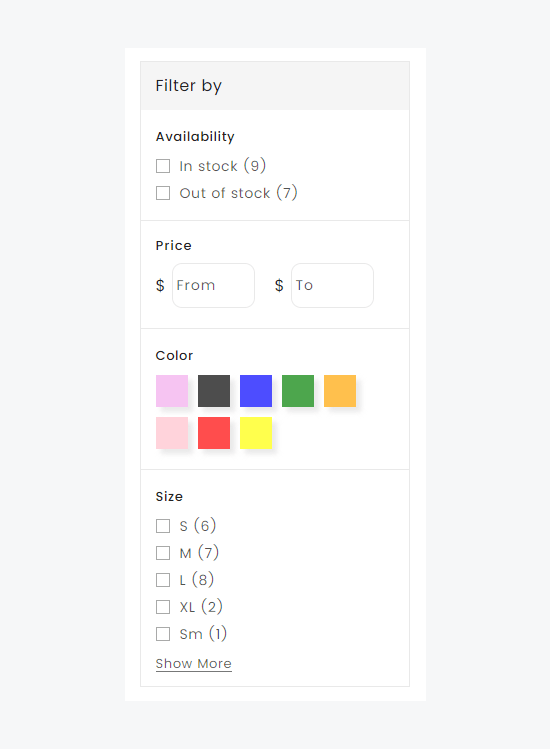
    Filters allows you to set up product filtering on your collection pages. When you enable filtering, customers can filter your products by availability, product type, color, or other options to find the products that interest them the most.

  • Available filters

    Filters for availability and primary price are included by default. Your product variants determine which additional filter options are available. For example, if you sell clothing with different variants for size, then you can enable a filter for size.

  • Add filters
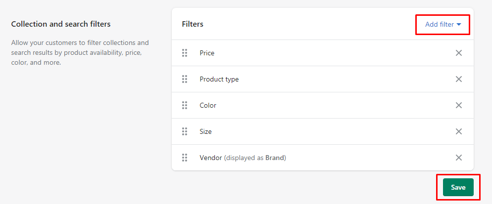
    1. From your Shopify admin, go to Online Store > Navigation
    2. Scroll down to Collection filters.
    3. Click the Add filter dropdown menu.
    4. Click Product Options, and then select one or more filter options from the list.
    5. Click Done to save your product options.
    6. Click Save to update your collection filters.
  • Filter products

    When Collection filtering is enabled, the filter options appear in the sidebar of your online store. There is no limit to the number of filter criteria a customer can select. After the customer selects a filter option, the resulting list of filtered products will automatically update to display products that match the customer's criteria.

Metafields

Metafields enable you to customize the functionality and appearance of your Shopify store by letting you save specialized information that isn't usually captured in the Shopify admin. You can use metafields for internal tracking, or to display specialized information on your online store in a variety of ways.

You can add metafields to your products, collections, customers, orders, and other parts of your store, either directly from your Shopify admin or by using an app from the Shopify App Store

Metafield Definitions:

Metafield definitions act as templates that specify what part of your store a metafield applies to and what values the metafield can have. Before you can add metafield values to specific products, orders, or other parts of your store, you first need to add the metafield definition for that information. Adding metafield definitions ensures that the same validation rules apply to every value that you enter for a specific metafield.

Metafield definitions have the following parts:
# Name Description
1 Namespace and key Together, the namespace and key create a unique identifier for your metafield. You can use a namespace to group similar metafields together, but each namespace and key combination must be unique.
2 Value The type and format of information that's contained in your metafield.
3 Description (optional) An description of the metafield to help you input the correct values. The description is displayed on the Shopify admin page where you add values for your metafield.
4 Validation (optional) A setting that you can configure to limit the values that your metafield can contain. You can set minimum and maximum values, or use regular expressions to control the range of accepted values for your metafield.

Adding values to Metafields:

After you add a metafield definition, you add values for your metafield on the corresponding pages in your Shopify admin.

Metafields are displayed in an editable table on your Shopify admin pages. Each metafield displays the name that you selected when you created your metafield definition. You can click in each table row to display the type of metafield and its description, and then enter a value.

Metafield content types and values:

The following table contains basic instructions for adding values to common types of metafields, as well as example use cases for each type

# Content type Description
1 Color Supports RGB values in #RRGGBB format.
2 Date Supports date values in ISO 8601 format and time values in UTC time.
3 Dimension Supports both whole number and decimal values. The units of measurement can be configured using either the metric or the imperial system.
4 Weight Supports both whole number and decimal values. The units of measurement can be configured using either the metric or the imperial system.
5 Volume Supports both whole number and decimal values. The units of measurement can be configured using either the metric or the imperial system.
6 Money Supports decimal values for price in your store currency, for example, USD.
7 Number Supports either integer or decimal values, depending on how you configure your definition.
Integer values can be in the range of -4,611,686,018,427,387,904 to 4,611,686,018,427,387,903.
Decimal values can be in the range of +/-9999999999999.999999999, with up to 13 digits before the decimal and up to 9 digits after.
8 Rating Provides a slider for selecting whole numbers within a given range, depending on how you configure your definition.
9 Product reference Supports linking to one or more products, depending on how you configure your metafield definition.
10 Product variant reference Supports linking to one or more product variants, depending on how you configure your metafield definition.
11 File reference Supports uploading a single file in one of the following file types: images & all file types
Images in JPEG, PNG, and GIF formats are displayed on your online store. All other file types are displayed as available for download.
12 Page reference Provides a link to a page in your online store.
13 URL Supports HTTP, HTTPS and mailto: URLs. You can limit URLs to specific domains when you create your metafield definition.
14 Text Supports plain text in either single-line or multi-line fields. Multi-line fields can include line breaks
15 True or false Creates a checkbox for selecting whether a condition is true or false.
16 JSON Supports raw JSON data for advanced scenarios when you need a structured data source.

Displaying Metafields:

After you add metafield definitions and assign metafield values to parts of your store, you can connect metafields to your theme to display your specialized information on your online store in a variety of ways.

Connecting metafields to your theme by using the theme editor:

You connect metafields to your theme by adding sections or blocks that support dynamic sources. For example, the Product info section can support product metafields.

  • After you add a section or block, you can select a single metafield by clicking the connect dynamic source icon:
  • If the connect dynamic source icon displays a +, then you can add up to 20 metafields by clicking the icon and then selecting one metafield at a time:

Deleting Metafields:

If you no longer want to have a metafield for part of your store, then you can delete the metafield definition and all of its associated values.

  1. From your Shopify admin, go to Settings > Metafields
  2. In the Manage metafields section, select the metafield category that contains the metafield definition that you want to delete.
  3. Click the metafield definition that you want to delete.
  4. Click Delete, and then click Delete again to confirm.

Credits

Font used :

Icon used :

Image used :

Note :
The images you see in the screenshots are used for demo purposes only, they are not incuded in the download package